Victorian House living room
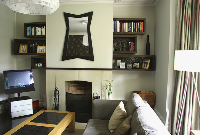
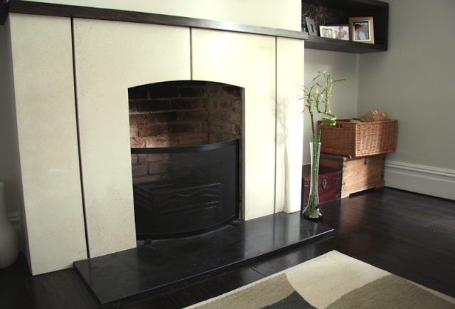
features: cast concrete fire surround with wood detailing, stained piranha pine box shelving, dark stained flooring, double sliding curtain rail, danish rosewood sideboard, architectural light shade, handmade radiator covers.
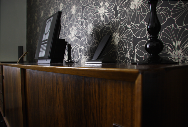
We chose to use an organic and muted colour range complimented by the use of dark stained material (including the floor), textures and subtle tonal changes to create an intimate room with a quiet aspect. We promptly got to work on a fireplace design, and hand cast a simple white polished concrete piece with stained wood mantle. A large L shaped grey corner sofa provides flexible seating. The vintage Danish rosewood sideboard from our lovely friends at The Modern Warehouse sits on the back wall against striking wallpaper.
Opposite, on either side of the chimney breast, there is a configuration of dark stained display boxes of differing sizes. They are like a sliding rule - each pair amounts to the same space, separated by the chimney breast. We used the wallpaper at the backs to set off the objects within, and create continuity with the feature wall. The large oak table with two slate insets is the owners own.
Above the fireplace is a very striking mirror which the owner purchased from a gallery in the Czeck republic. Its strong features also informed the design and it adds a great focal point to the room.
The cut perspex pendant lamp is designed by Louise Campbell for Louis Poulsen, titled 'collage', has 3 concentric white perspex rings which have been laser cut with a floral motif. When the light is on, it creates a wonderful flecked floral pattern around the room, especially when the light is subdued. As there are many strong design elements in the room, the light shade doesn't actually dominate, it rather delicately absorbs with colours. In fact it tends to sit in the background until lit when it takes on its splendour.
The ceiling rose that you see, is a beautifully crafted plaster reproduction of a heritage piece that was installed as part of the design.We felt the ceiling looked rather sparse without it. While it wasn't evident that a ceiling rose had been there previously, the room has fine original cornice molding, so it sits perfectly well, and creates focus and mixes the old and new with the contemporary chandelier.
Two pairs of curtains, one sheer linen for privacy, the other a thick raw weave cotton for warmth, are full length and hang on a double bay window pole in brushed steel (a piece of clever engineering) It is finished off with hand blown glass finials. Small touches against large bold pieces help to create little surprises that enhance the experience.
Below are a few detail shots from the room.


