a north oxford house

Drawing room and dining room >

In this drawing room (a proper, first floor affair) light and the huge windows are all. We wanted to create a design that played with formal traditional drawing room style, and messed about with it, adding colour and fun. A huge element of the room is the floor to ceiling shelving structure, which is constructed from ash with an ebonised hardwood that delineates and configures the structure. This was designed to house various elements including books, objects, TV and media and a stereo with space for cd's. This was a one-off item which we created for the client. It holds your attention and commands the space that it lies in. There is an almost art deco feel to it, with the dark and light woods and polished finish.

detail of shelving

The sofas were sourced from Fran at Liscious Interiors, and re-upholstered in striking fabrics in soft brushes cotton. The colours reflected the dining space but lifted and lightened. The Chesterfield grey sofa has a purple running through it and we applied very bright violet buttons to the piece and dressed with lime accents. The lime - or chartreuse - Chesterfield was very simply dressed and as such we reversed the colour works and had predominantly purple striped cushions in a deep velvet. 

A small day bed wrapped in a defined purple inhabits a space close to the book shelves and near to the distinctive sash windows.

A  balance between privacy and letting the light through was achieved by way of full length linen curtains with a silk floral motif running through, and a sheer roman blind that drops down (colourfully) to frost out the background, again in natural linen but with colourful stripes.

We strongly felt that this huge space did not need a central ceiling light, but to light the space with

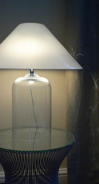
soft accent lighting at lower level would create better intimacy and harmony in an evening. The Alega glass table lamps (designed by

Vico Magistretti

in 1970) sits on Platner side tables, each a stainless steel spoke framework with a glass top created by

Warren Platne

r for Knoll in the 1960's. 

Platner side table with Alega lamp

The beautiful carrera marble fireplace is a focal point, its gas fire supplementing the classicv column radiators (in anthracite) we put in, and the alcoves either side are wallpapered with a fantastic

Jocelyn Warner

design. Period chairs were limed and re-upholstered in a funky silk, and an

Elizabeth Blackadder

piece catches the eye above the fire.

Dining Space >

glass table reflecting the window

Previous to its present incarnation, this was a jumbled space, cold and dark and possibly with mixed use. In its present form we decided to change shape a little. Keeping the 'hand made element' we made something a little more formal i.e  an evening dining space for guests.

Our client wanted a dark, intimate and rich palette, but with linking colour from the drawing room next door. Assisted by our client the colour we chose was a plum colour, in a proper flat matte, not cold. It sits more in the red spectrum. This gives it a deep lushness that with the addition of evening candle light, brings in a grandiose quality.

Add caption

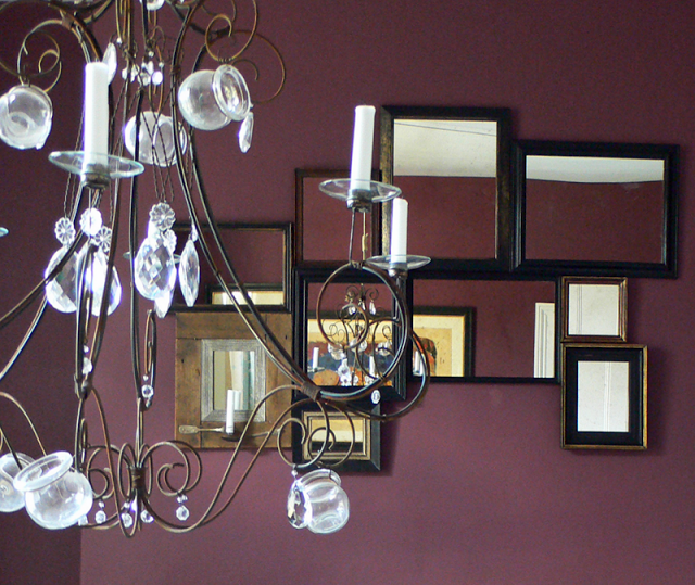
Of the candelabra; it is hand crafted by French makers

Benoit Vieubled

and acquired through

Cameron Peters Fine Lighting

. Its artisan qualities shine out. Made from brass and copper and french glass yoghurt jars and crystals. It was further modified by myself with deft assistance by the owner, converting it from electrical to hold candles. Furthermore, it hangs by sash cord which is fixed via a pulley system and tied off near the dumb waiter. This allows the piece to be raised and lowered when necessary. Secondary lighting is via the picture lights overhanging the inherited pieces of our client.

On first entering the room from the hallway it becomes obvious that the dumb waiter is no longer functioning. Due to modifications in the past it had become a non viable restoration project. This left us with the awkward shape in the corner! As the owner wished to house some of his wine collection we decided that the best purpose of the woodwork was to turn it into a wine rack. I think this works especially well and looks rather neat and perfect as well as being architectural and fun.

wine storage

The carrera marble fireplace needed extensive cleaning to the marble to bring it up to a gleam. The hearth was simply of limed concrete and as such was painted black. A writing bureau, hand painted by Maitre Allegre now sits in the alcove closest to the window.

A collage of mirrors that we collected from a host of places hang in a pattern above the fireplace.

detail of candelabra with mirrors behind

Under foot, the carpet is a fine boucle in a light grey that adds a level of luxury to the rooms. It runs through the dining and lounge space and spills on through the hallway and staircase.

Below is a picture of the hallway with the dining space chimney wall framed in the antique mirror.

a new arts and crafts - a maple kitchen - north oxford house

North Oxford house with an arts and crafts twist        

Kitchen

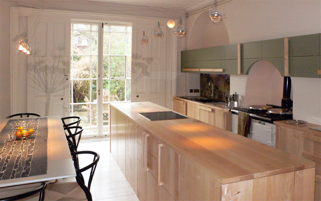
hand made kitchen in maple with crafted panels, pre mural.

The Parktown area of Oxford is a famous landmark site and this project was sited within one of the crescents that exists. The house was built in the late 1850's and was designed by Samuel Lipscomb Seckham using bath stone as the main building material. He was a surveyor who was commissioned by St John's college to develop the area. Should you wish to visit you will see that It is very reminiscent of the famous crescent at Bath, and was no doubt designed to air a similar grand quality.

The project was to be the total revamp of one of the houses in the crescent (in stages), and as such the owners had decided to commission us to 'lift its spirit'. This project was a total pleasure in many ways, as we both loved the house and its character. The house is set out over 5 floors, the piano nobile with the drawing room and dining rooms on the 1st floor with views over the Parktown gardens. Initially there was not a great deal of harmony in the house (design-wise) as it was split into several separate apartments at some point in its near history. This then meant having a total vision for the place, whilst staging the works and bringing the different spaces together again. Whilst first impressions of the house in this state would to many dictate a total 'rip out' and refurbishment, we felt, with the support of our clients, that a restoration approach could achieve more and retain the character of the property. Restoration is a gentler, but more intricate, complicated and sometimes time consuming project, but the end result is so much subtler and kinder to the house that we believe it is well worth it. It seems a shame for example to replace a lathe and plaster wall with modern plasterboard just because it is flatter - after all, the character of an old house is in the quirks (and ripping out old lathes always makes we think of the person who whittled each piece of timber individually).

Whist full of character, the house had been badly mistreated in some ways, and many of the period features were somewhat obscured. Its most notable features were the beautiful handrail that trailed throughout the floors; the tall glazed internal doors; the high ceilings with original cornice and the fireplace in the ground floor living space. The main carrera marble fireplace housed decorative Duncan Grant tiles and it was this detail that gifted us the idea of using art and craft to give the house an artisan feel, that it possibly once had. We wanted to take the core concepts of arts and crafts, but tweak and modernise, and see if the ethos and character could also work within a contemporary and modern sleekness. 

Many of the items that you will see throughout are either one-off or unique in someway. So, while we adapted some of the arts and crafts designs, we weren't faithful to them. In fact we gave the designs a modern twist, something that would sit alongside individual modern items and not look out of place.

It is a house like no other and so for inspiration we decided to visit Blackwell House, an arts and crafts exhibition house, situated in the Lake District, which houses a wonderful collection of relevant pieces. William de Morgan tiles adorn the fireplace surrounds in the large house. Also on show in the exhibition at the time, were lots of ceramic work. The hallmark of the arts and crafts period was the level of embelishment. Nothing was left blank and ordinary if at all possible. 


At the time of investigating where we should place our design, we came across an artisanal nature to the craft industry in Holland and in the UK.  Leading designers like Hella Jongherius, were bringing their passion for 'handmade' skills within modern production methods to the table. 

cowparsley splashback with led lighting


So it became quite clear, that within the make over, it wouldn't be out of place to acquire craft from other sources to sit alongside our own brand of arts and craft informed designs, and link through for a very unique experience.

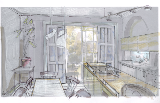
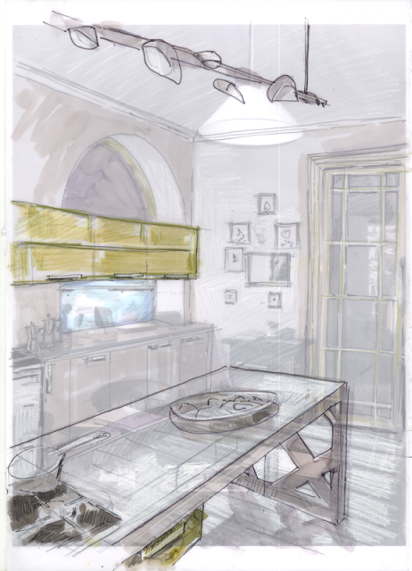
initial design concepts

initial design concept 2 (island unit)
.

The project began at the deep end with the transformation of the kitchen and ground floor lounge area that ran into each other separated by 2.8m high glass double doors.

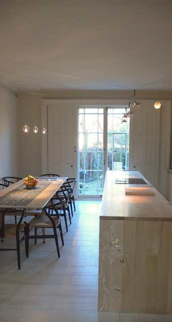
kitchen; The main features are the maple worktops,
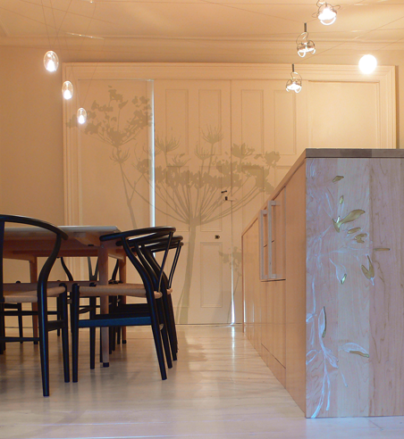
white washed flooring, mural, backlit bespoke splashback and the Hans Wegner dining room set with a soaped wood finish, the aga that sits in the middle and the suspended lighting. 

the lighting with its suspension cables allows flexibility in the positioning of the light modules.

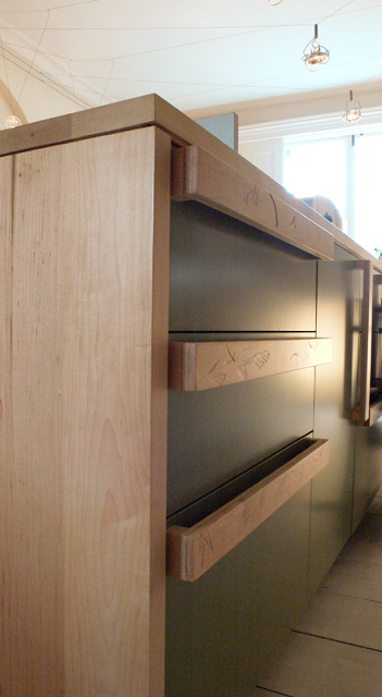
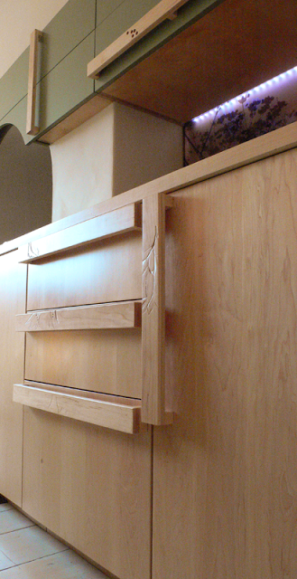
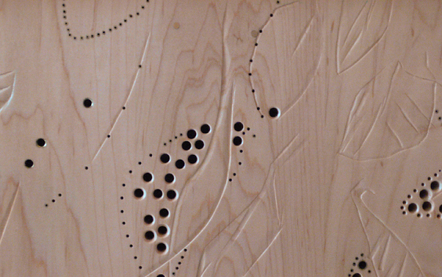
Its a galley style kitchen, tapering to the back wall. A 3 metre long worktop island unit separates the dining space from the rest of the kitchen, and cupboard doors to the dining side give access to plates and glasses. The island unit is made using solid maple, providing storage and housing two built in fridges. An electric oven and a ceramic hob supplement the aga, and provide alternative cooking means during hot summers. The handles were created using maple and brass as an insert. Each of the handles were carved with their own unique pattern.


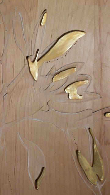
The element of carving and piercing also shows in the end panel of the island unit. 

fine detailing in the maple 

brass inlay into the maple side panel

The colour scheme is light cream, sage green, natural blond wood with black elements and details. On the wall with the aga to the centre, a long set of wall units with doors in a matte sage green, spans the full length of the room, straddling the large chimney breast, serving to emphasize the length of the room. Below, the base units continue in solid maple.


The lighting throughout the room was commissioned from Album lighting via the marvellous Cameron Peters Fine Lighting  based in Ardington, near Wantage, Oxfordshire. Album, an Italian firm, specialise in suspended LED and halogen lighting for heritage projects - since the cabling runs around the top of the walls, and is only fixed at minimal points, it is perfect for heritage or valuable ceilings, and much more sensitive a scheme than halogen spotlights. We chose a mix of light modules for interest and to mark different areas - thus elegant blown glass fittings are suspended above the dining table, and architectural spotlights provide task lighting above the island. For fun, a single moon piece hangs above the sink area.

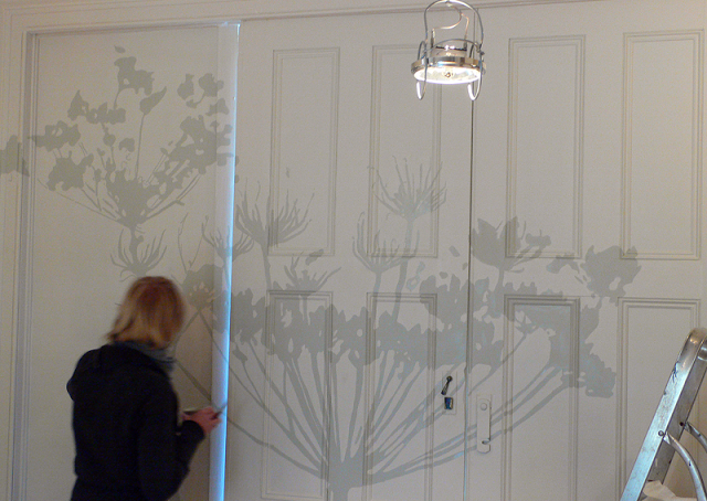
Full height sliding wooden doors act as shutters in front of the glass doors which lead to the garden. We adorned these with a mural of cow parsley, in a slightly darker colour than the paintwork, so as not to make it too pronounced, but play with how you percieve the room and how you experience it. 


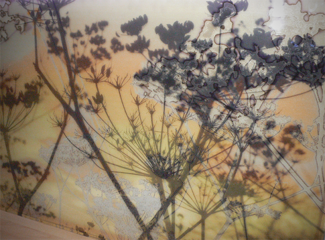
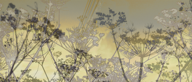
The cowparsley theme ran into the splashbacks. This was experimental (a technique more often associated with exhibition stands) but works tremendously well. They are very colorful and add another level of patternwork that uplifts the space either side of the chimney breast. These were designed by Charlotte and printed onto thick perspex. The perspex was separated by a few centimetres from the wall, and an LED lighting strip was placed between, in order to light up the panels from behind and add further refinement to the overall design. They fit very precisely from worktop to underside of wall cabinets.

cowparsley etched onto the plexiglass

plexiglass backsplash design


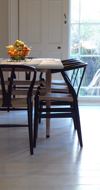
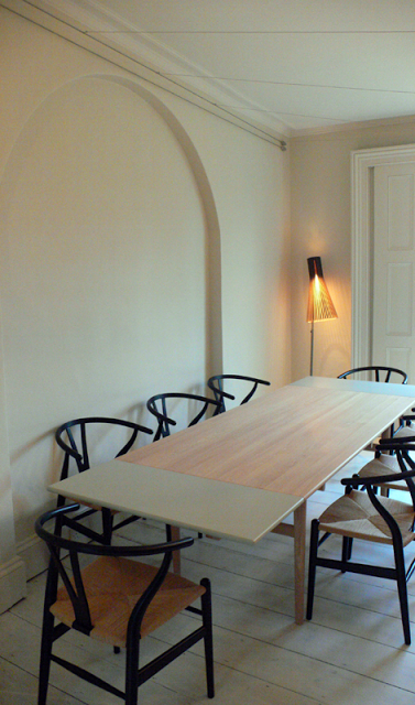
The table and chairs are classic designs by Hans Wegner. The table is soaped oak, which is an under-used finish these days, but is no less hardy than varnish. It is non yellow and soft in appearance. This consideration of material is just whay you would expect from the master craftsman.

hans wegner table and chairs

dark chair detailing and table in soaped oak and grey


More Scandinavian design appears with the Secto floor lamp in black and natural birch wood, designed by finnish architect Seppo Koho.


All in all, the room is a blend of materials, textures and style that hints at what will continue elsewhere in the house.

Light, open, softly spoken but crafty and unique.