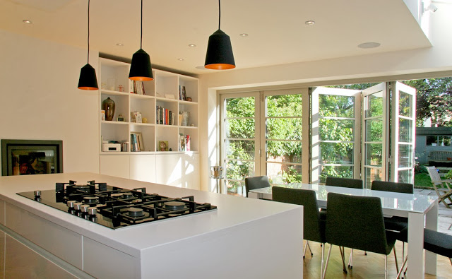
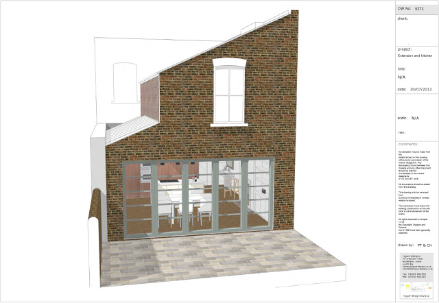
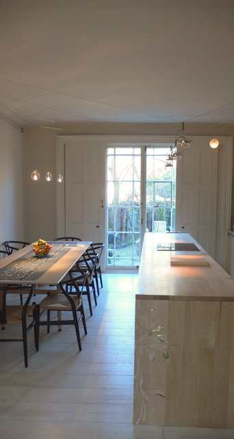
A Victorian townhouse was brought into the 21st century with a new full width, 9 metre extension devised through collaboration with architect Keith Durham, that houses the kitchen and dining spaces. The premise of the project was to increase the ground floor space giving better functionality to the house and to allow the family to experience a greater sense of freedom within it. Alongside the extension and kitchen shown here, our brief was to apply a smart townhouse aesthetic throughout in a refurbishment of the whole property.
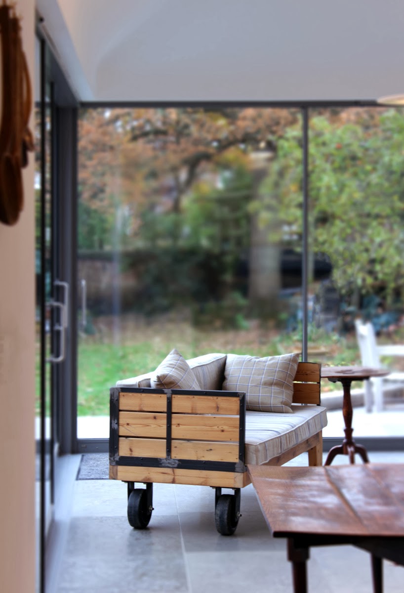
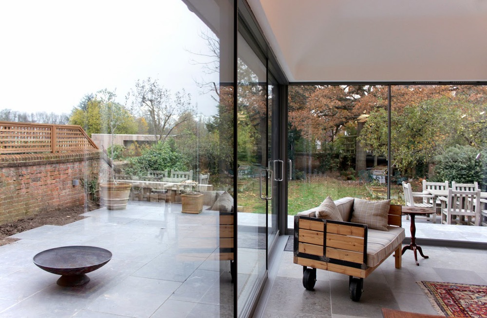
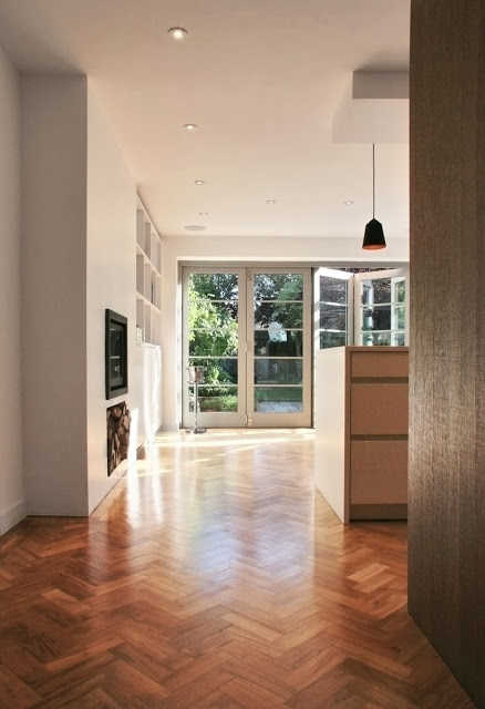
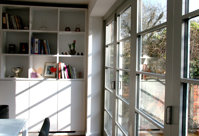
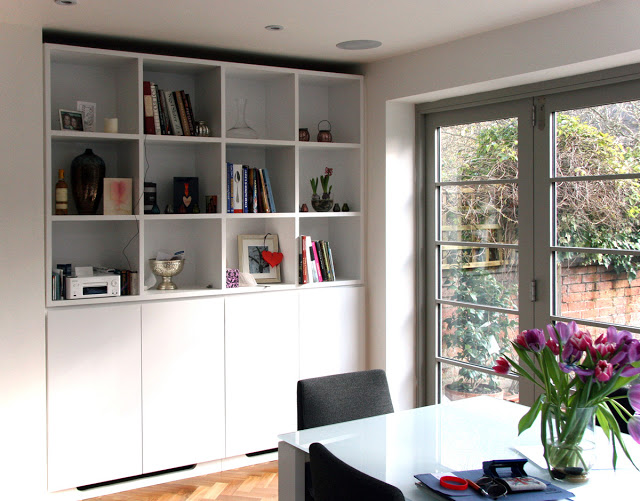
The a wall of folding doors, and exotic and rich teak parquet flooring were integral to the clients wishes as they represented very strong and important aesthetics. Working with the charm of the original Victorian house, we wanted to produce a bright, modern, crisp space, that linked through from the original by using the warmth and detailing of flooring and joinery.
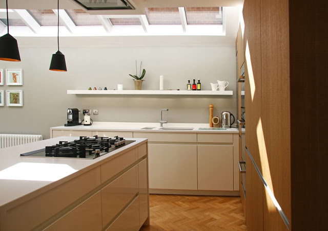
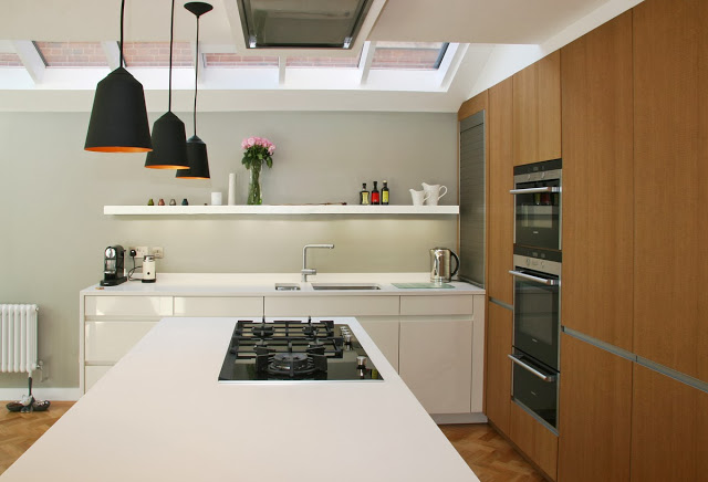
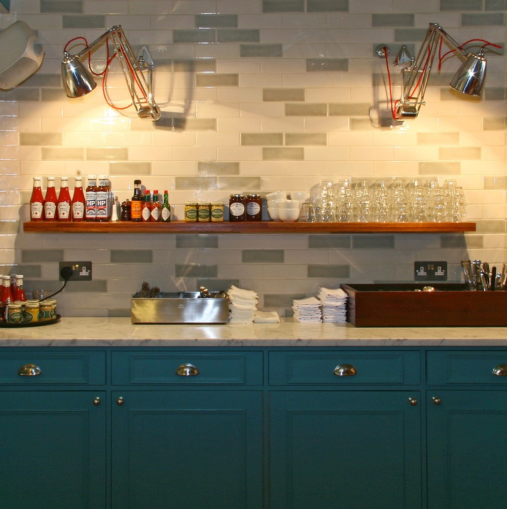
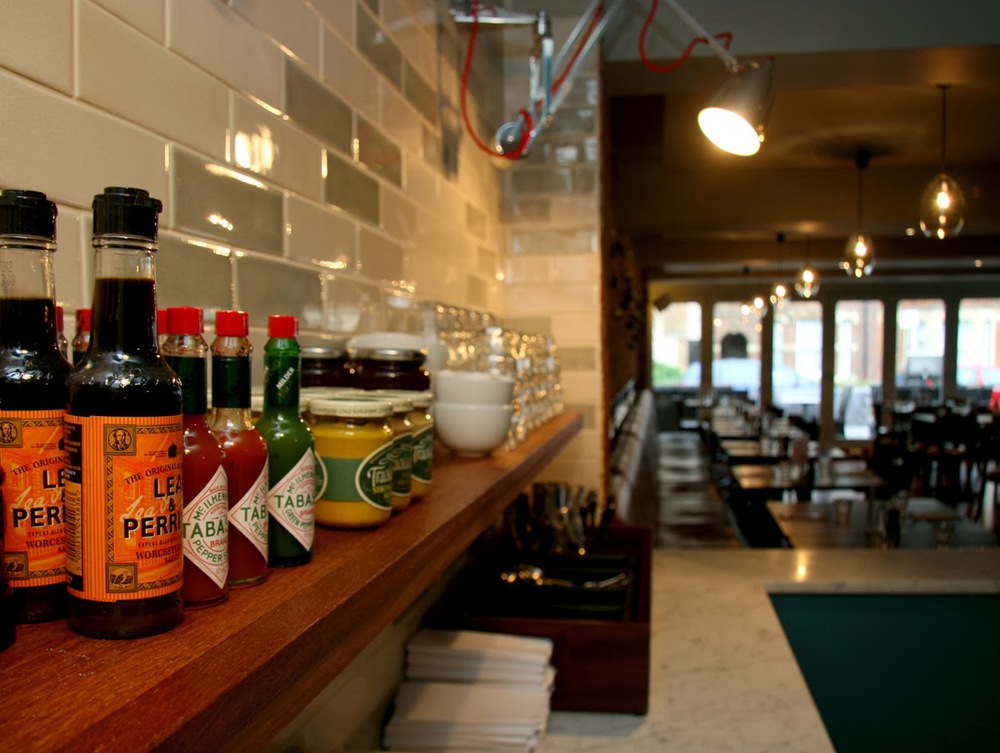
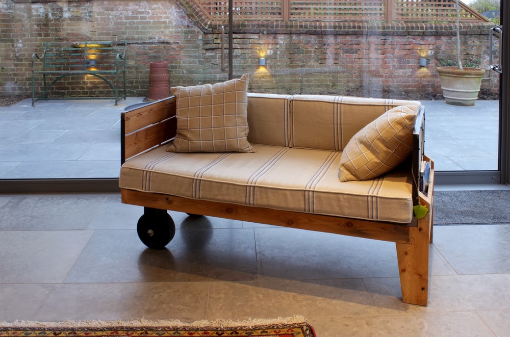
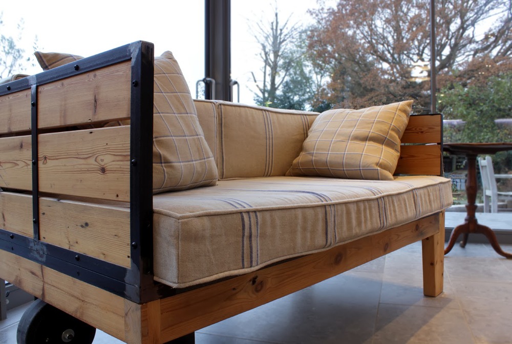
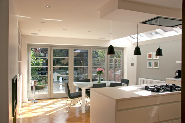
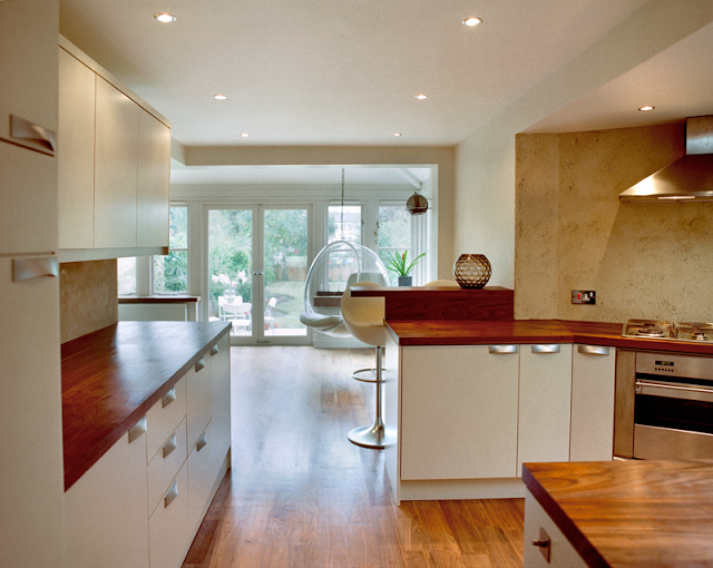
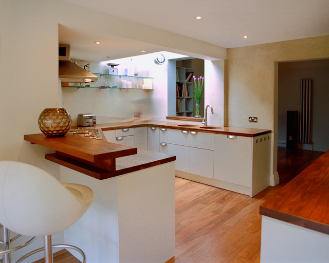
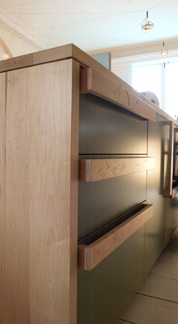
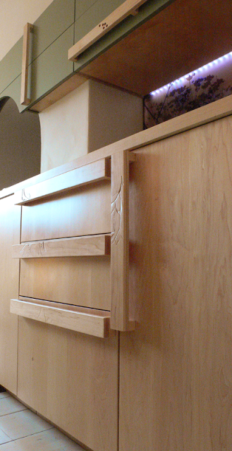
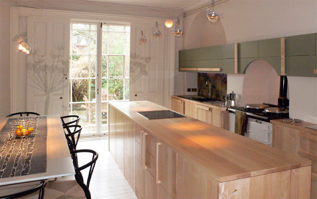
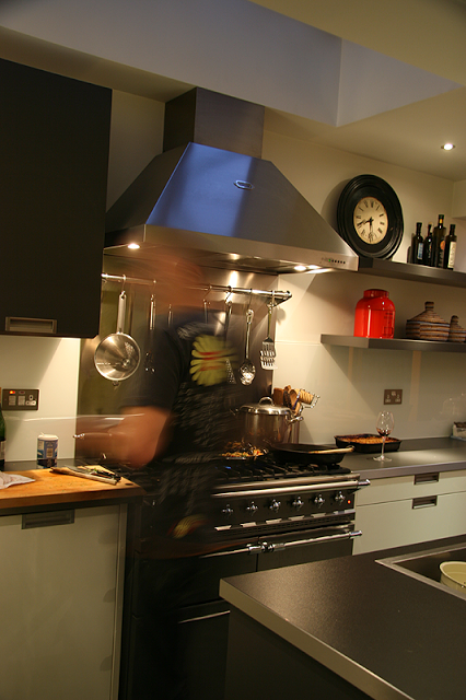
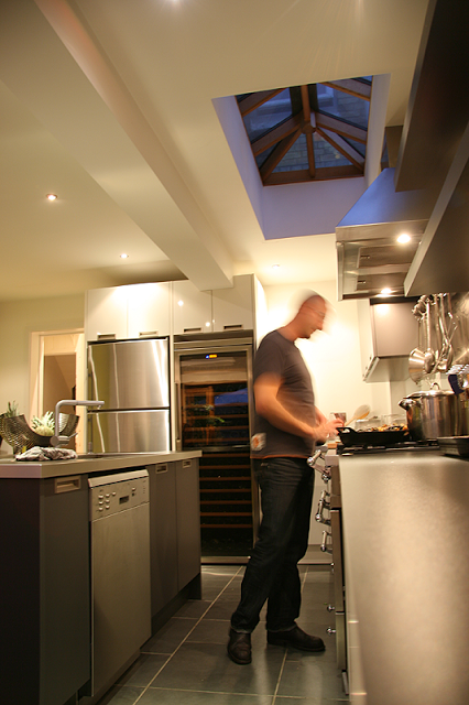
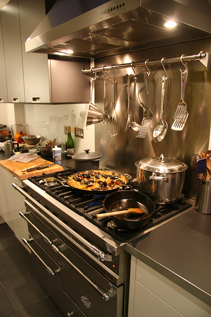
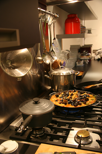
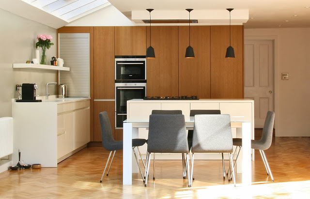
The kitchen design was devised alongside Martin Williamson of InHouse Kitchens, featuring Leicht furniture and Seimens appliances, and the top is a honed matt white composite stone top, which on the island wraps around the two ends. The bank of full height units in a brushed and textured copper oak cleverly conceals the integrated appliances whilst adding texture and substance to the room. The units are double thickness and appear in certain frames as a large mass. Units on the back of the kitchen side add a great deal of extra storage whilst consuming a small but light cloakroom and lavatory snugly separated from the living spaces. Patent double glazing along the one side of the extension floods light through giving that sense of openness that characterises modern living. Ligne Roset furniture further enhances the dining space.
In the far corner of the bank of units a tambour unit conceals a pull out coffee maker and other kitchen aids.
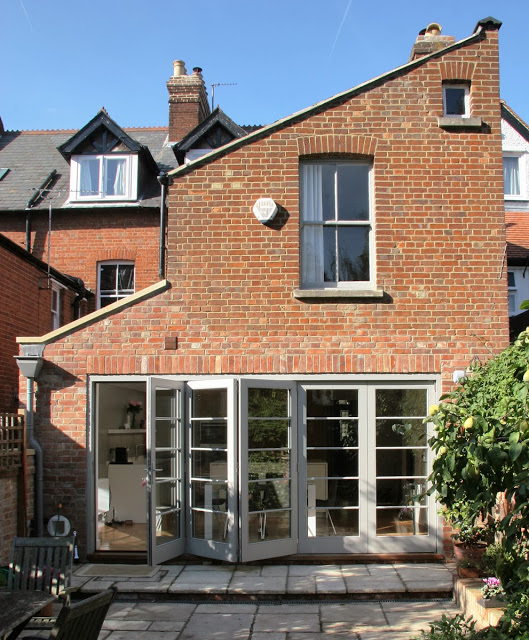
The folding sliding doors are bespoke joinery units made for us by Stuart Barr Joinery, informed by the look of the Nigel Slater bi-folds in
Nigel Slater's Simple Cooking.
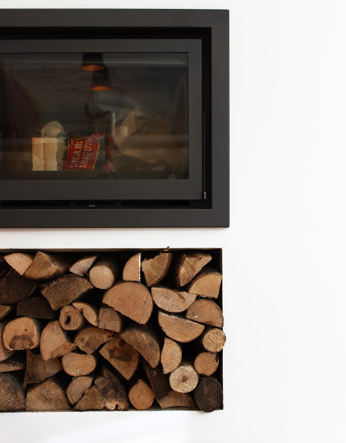
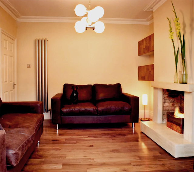
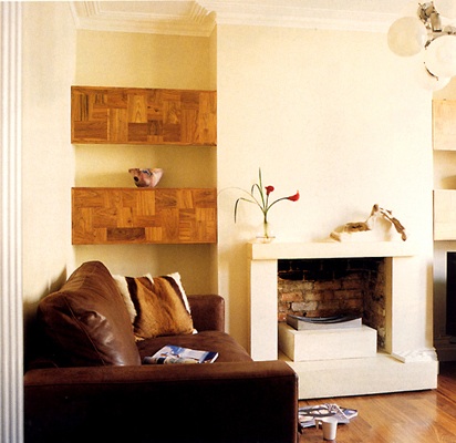
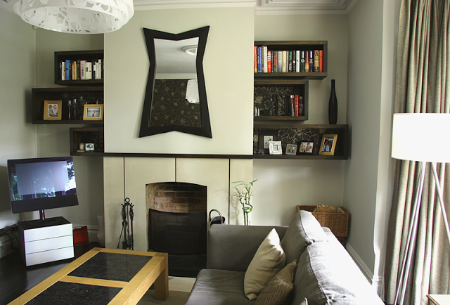
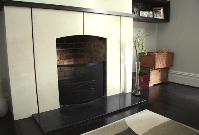
The whole scheme was devised with the addition of a fireplace set into the existing chimney void. Initially it was to be a functioning proving oven but was revised to a multi-fuel stove for increased warmth and celebration throughout. Be
low shows the integrated scandi fireplace with valuable log storage space below.
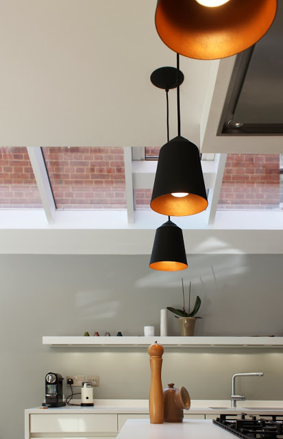
For drama and purpose over the island we used three Circus pendents from
Innermost. They are sprayed black on the outside with a copper gold look on the inner. Other lights used are under shelf task lighting just above the sink area and on upper cheek of the ceiling, three discrete white Hero spot lights to add an extra degree of function.
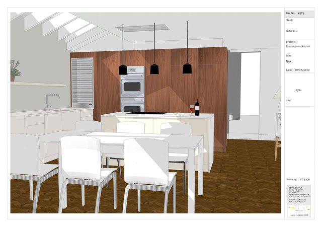
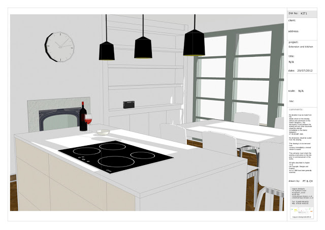
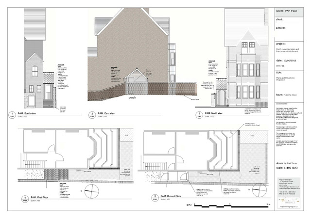
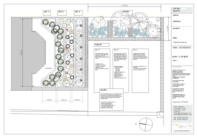
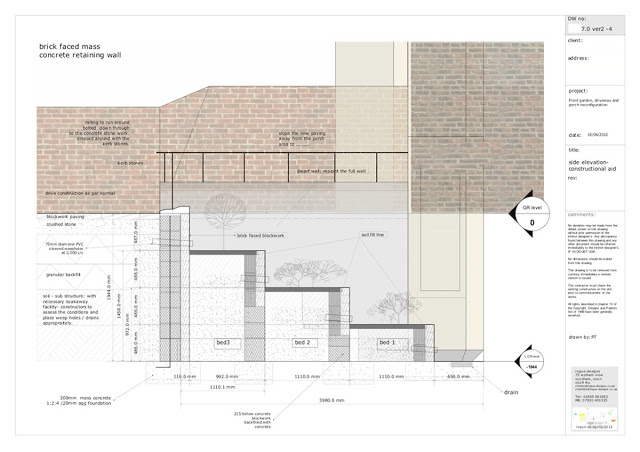
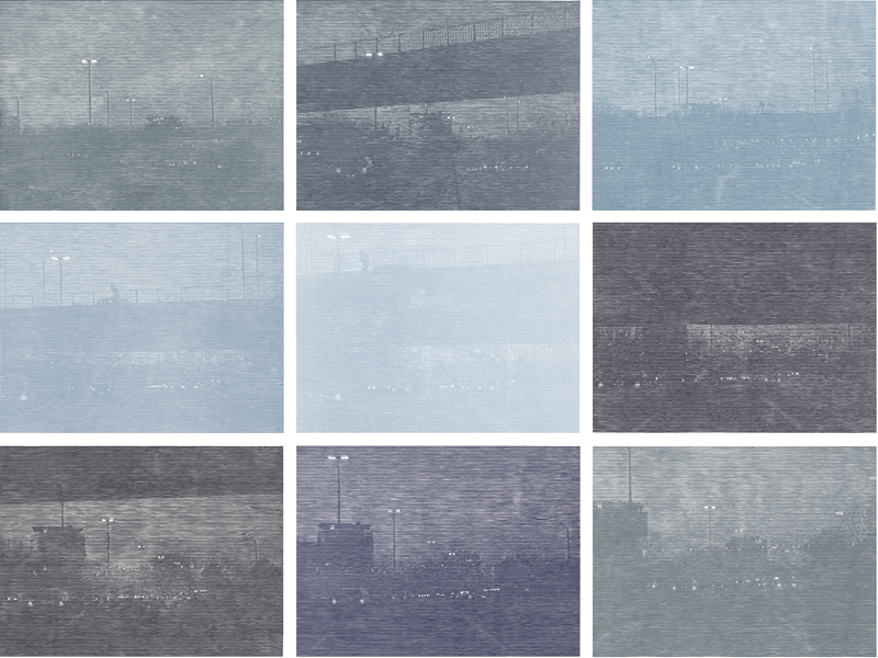
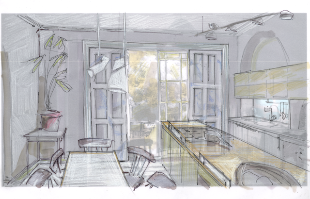
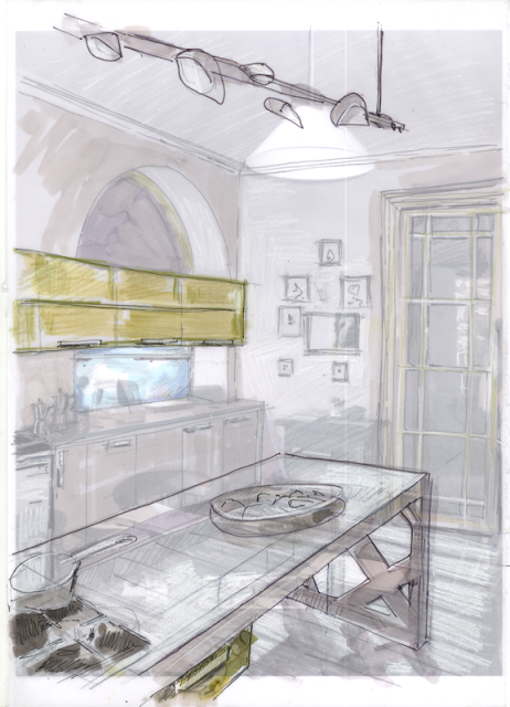
Below are examples of some of the design material we prepared and used for the process of client communication.
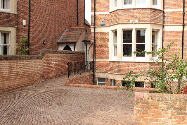
exterior view of side extension and bi-folding doors
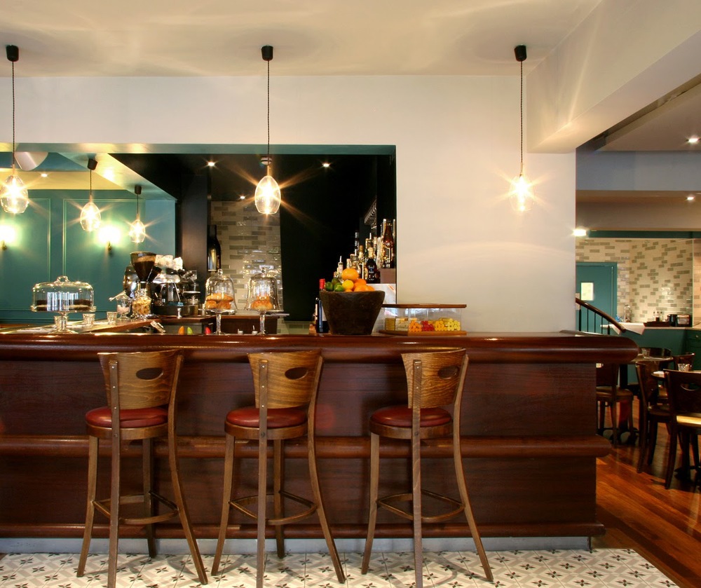
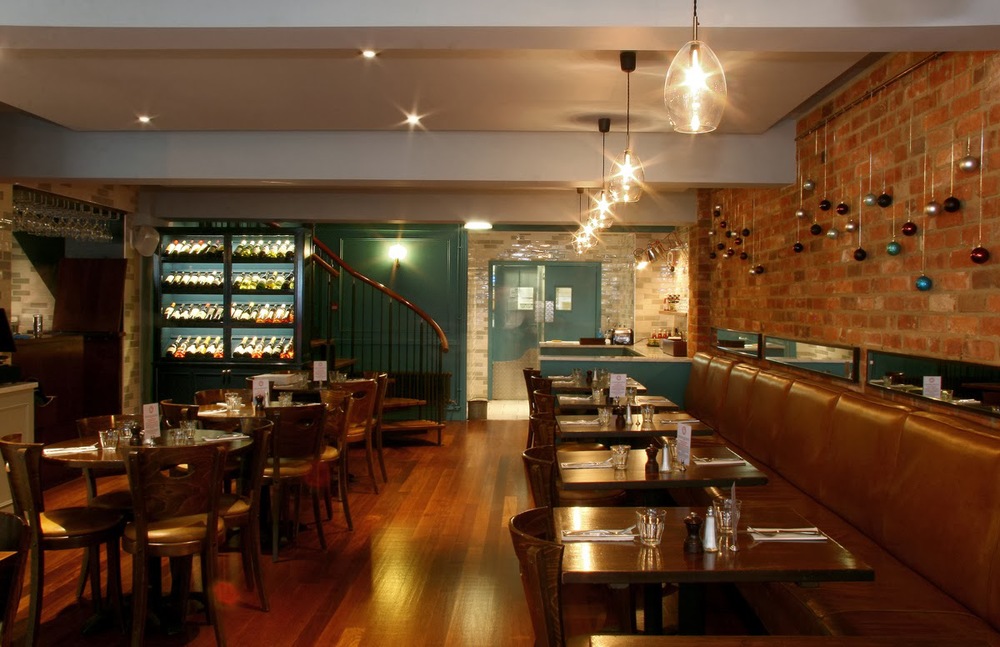
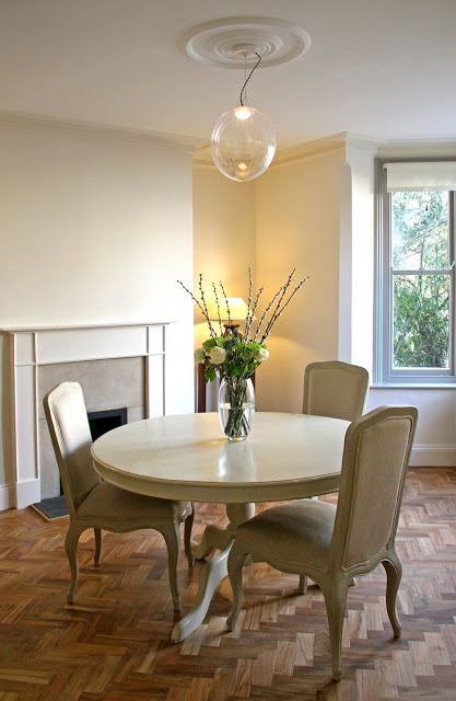
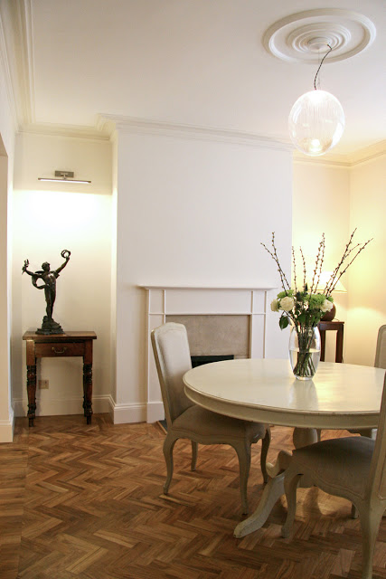
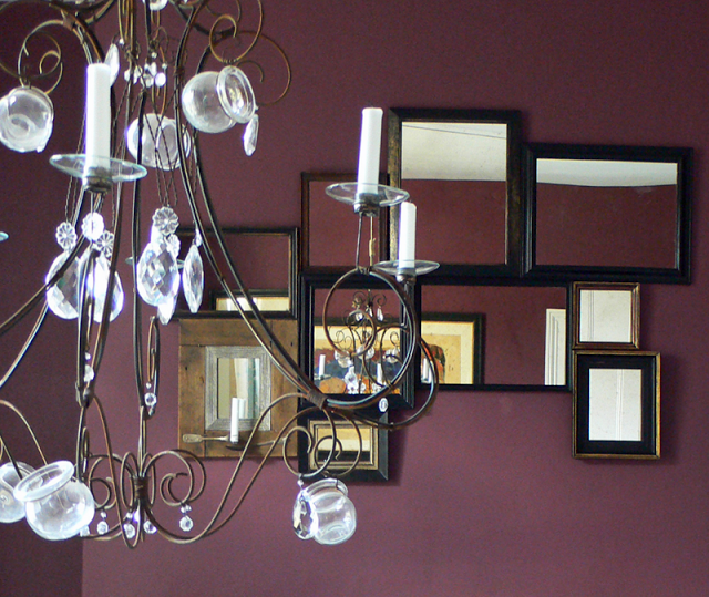
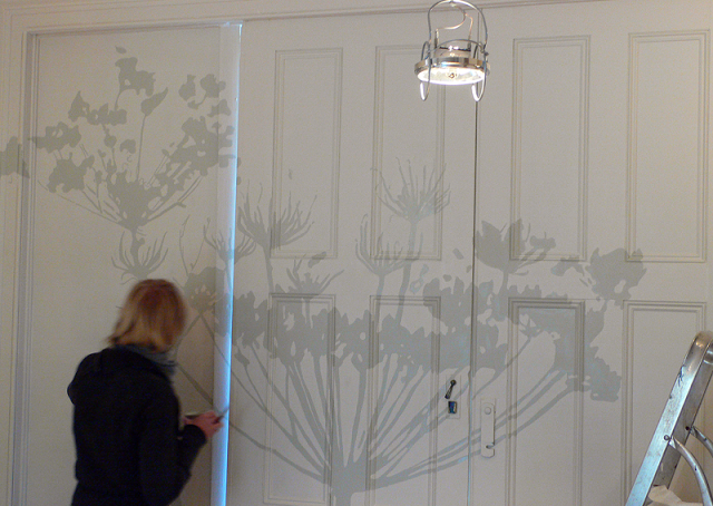
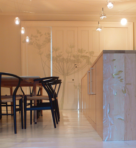
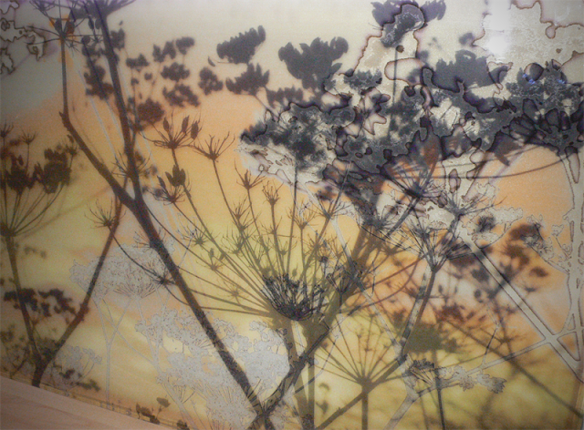
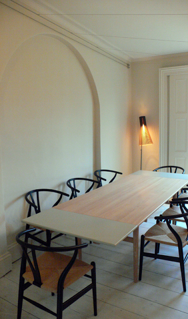
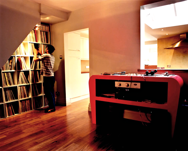
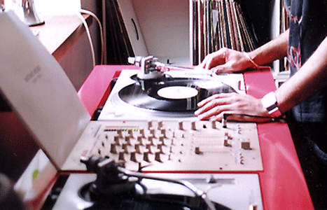
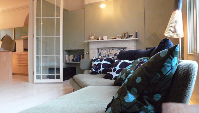
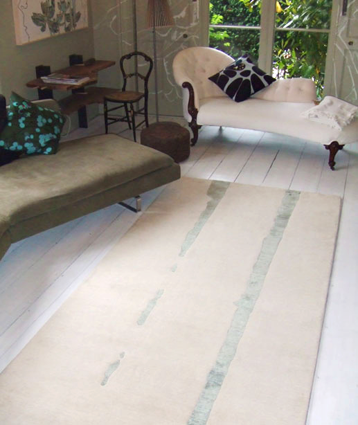
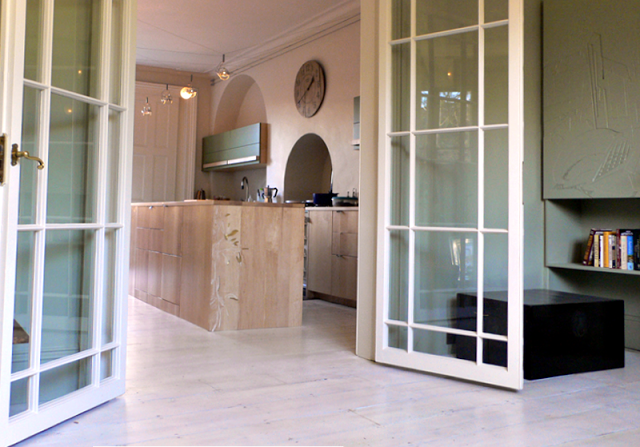
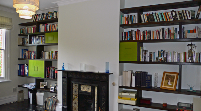
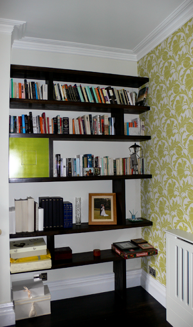
The whole of the ground floor received further treatment, turning what was the old kitchen into a library and media space and upgrading the dining room into a more formal space for entertaining. For continuity the teak herringbone flooring extended throughout the whole of the ground floor complete with a double edging detail. The pendent lighting is a fabulous mouth blown crystal glass piece by design studio
Atelier Areti named Kirschlag. Two lamps were commissioned and occupy this and the adjoining sitting room / library. Both have differing lightly feather etched patterns and are exquisite with or without light.
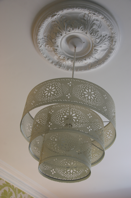
The round ceiling rose, as so often happens in these types of properties, disappears over time and it is often a great event putting them back as they add focus and elegance to a room.
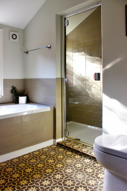
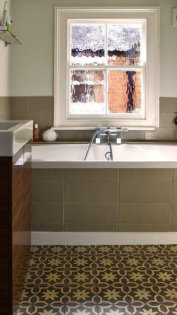
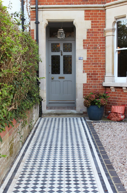
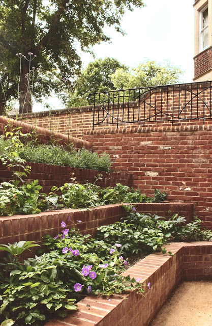
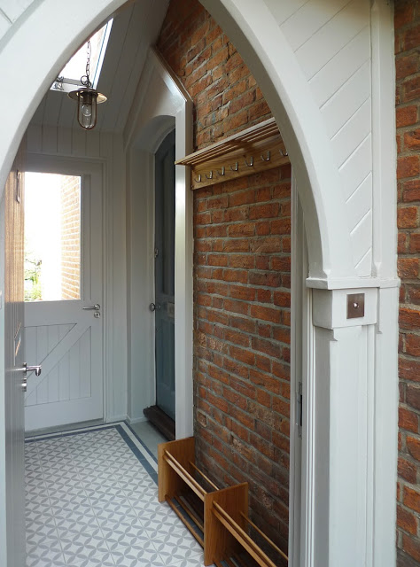
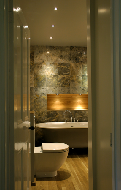
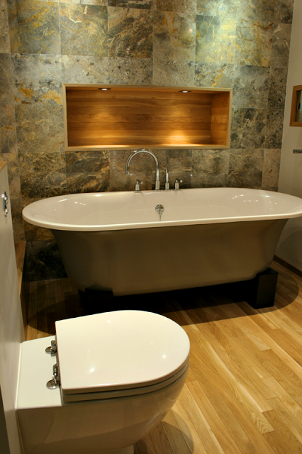
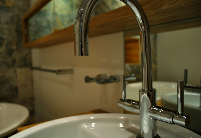
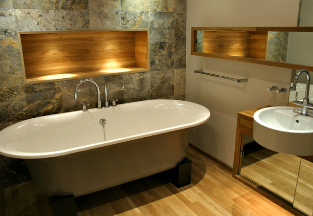
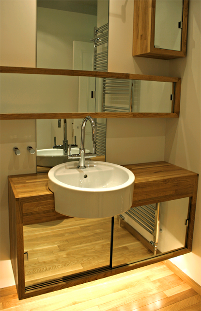
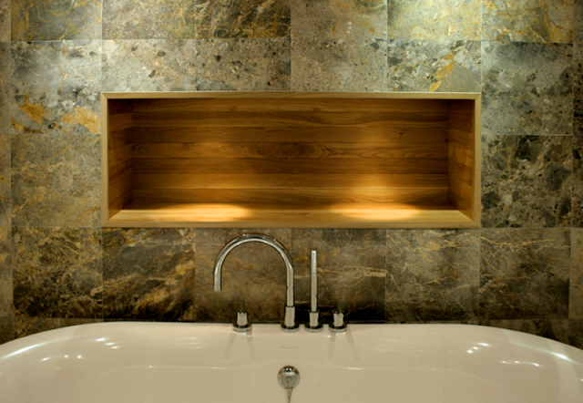
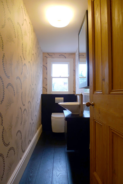
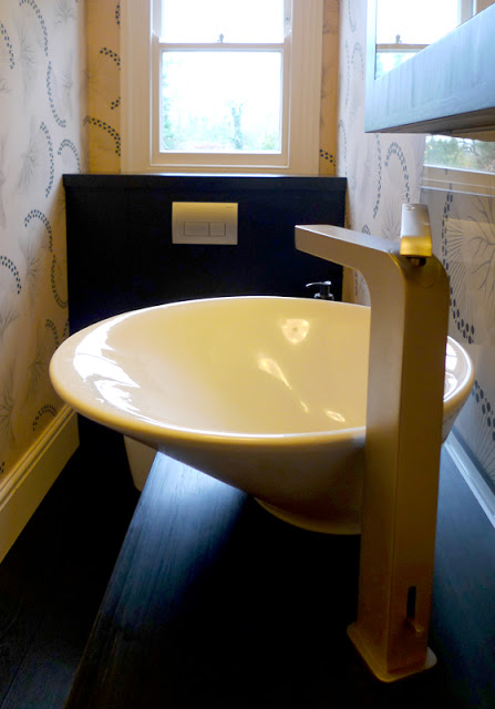
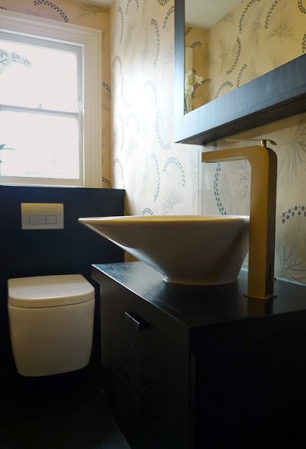
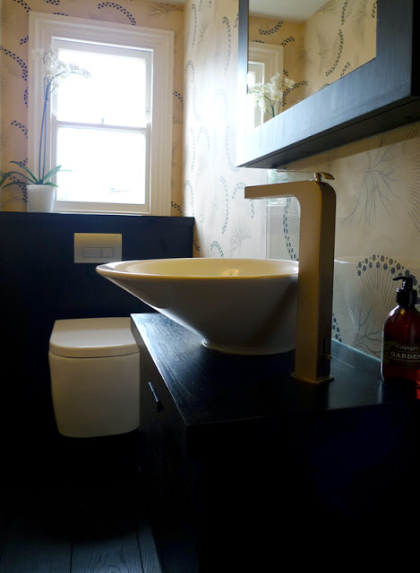
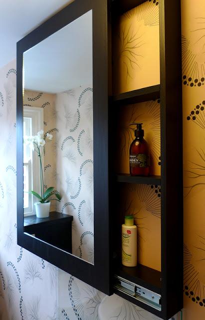
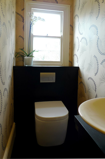
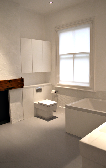
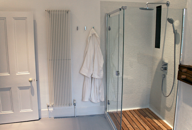
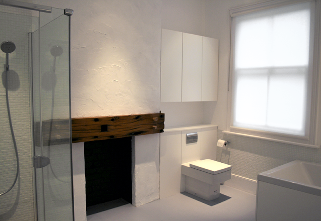
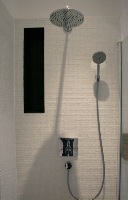
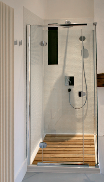
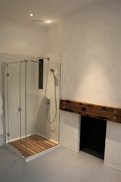
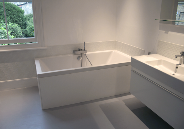
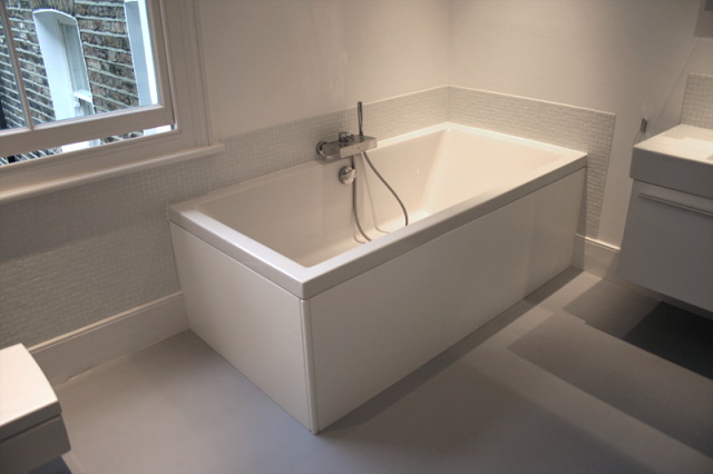
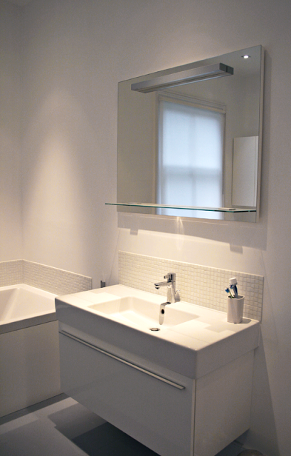
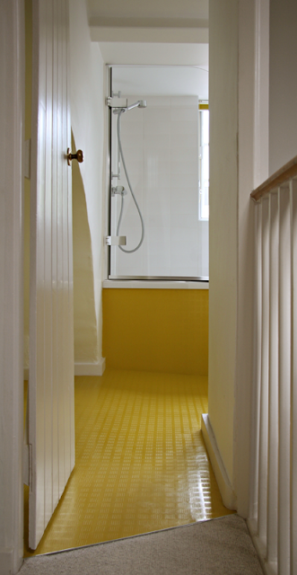
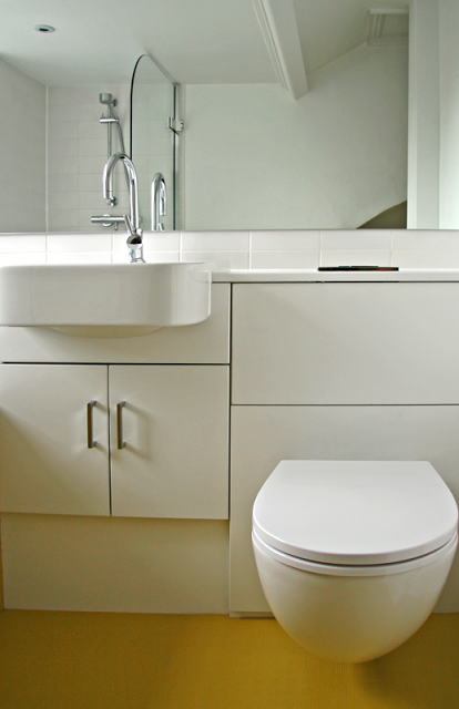
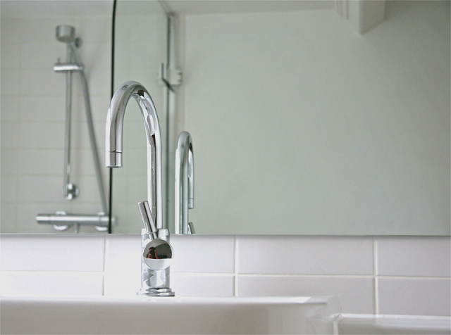
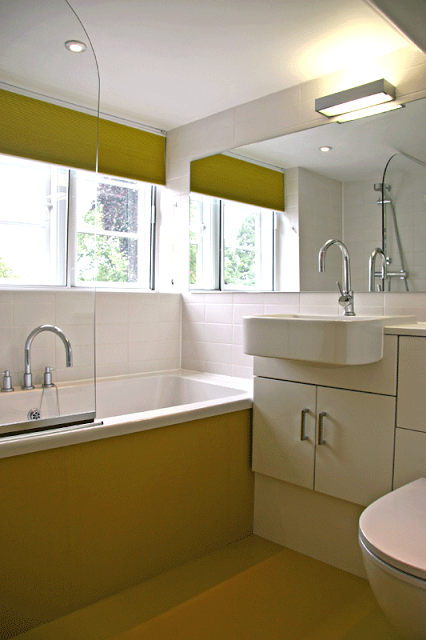
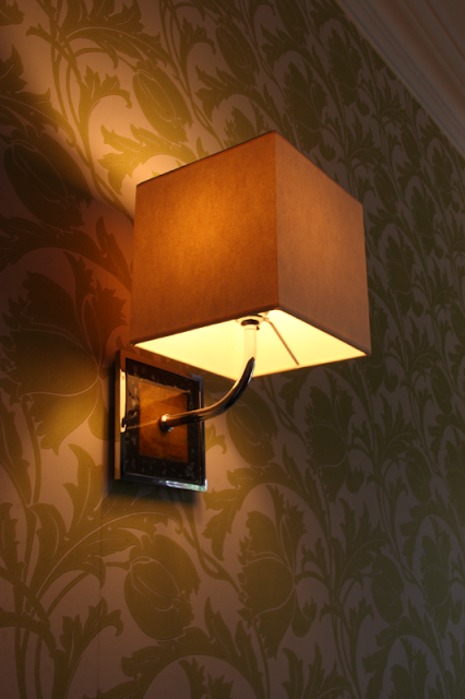
Upstairs we updated bathrooms, including this one shown with encaustic patterned cement tiles from Portugal, which we also adopted for the exterior facelift to the front of the property.