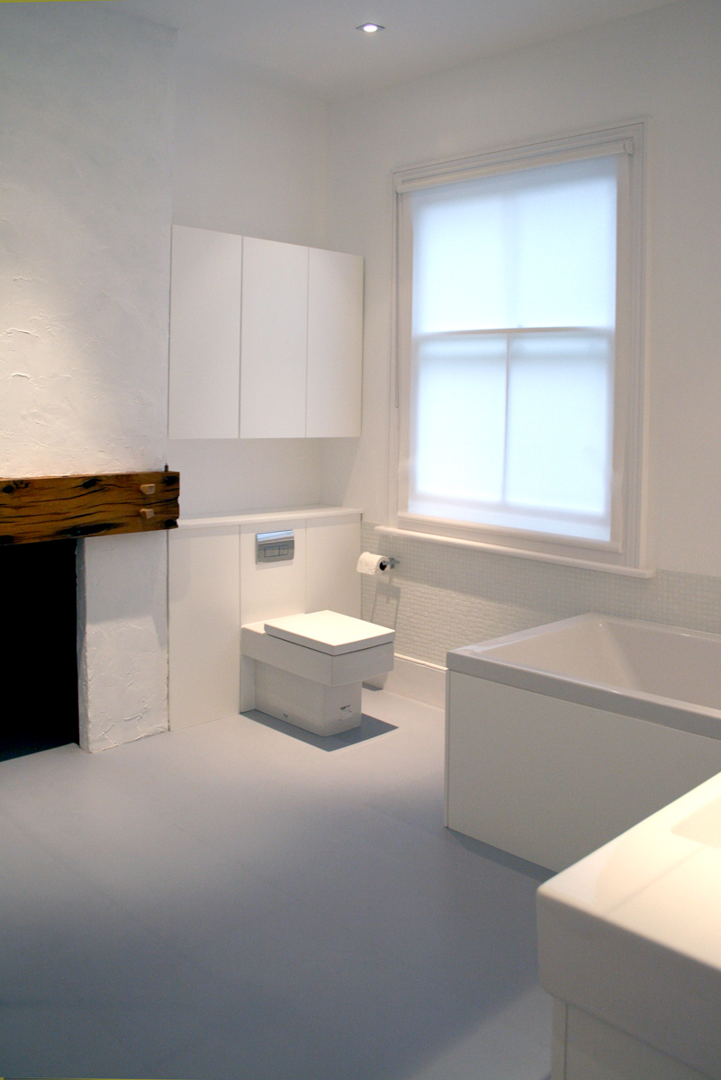
In the end the space was expertly crafted and every white good was nested in place. From lowering the ceilings to cutting down vanity units, every aspect of the fit out was carefully assessed and planned out to make sure that no space was lost and that the experience was as generous as it could be, given the dimensional restrictions.
Atmosphere and pleasure was integral to the experience we wanted to eschew and t
he owner had requested a look that was both Italian and bold and would reflect elements of their life in Florence. The design was one that we are very fond of. It had a very clear
character and a personality that we never thought possible looking at the floorplan.
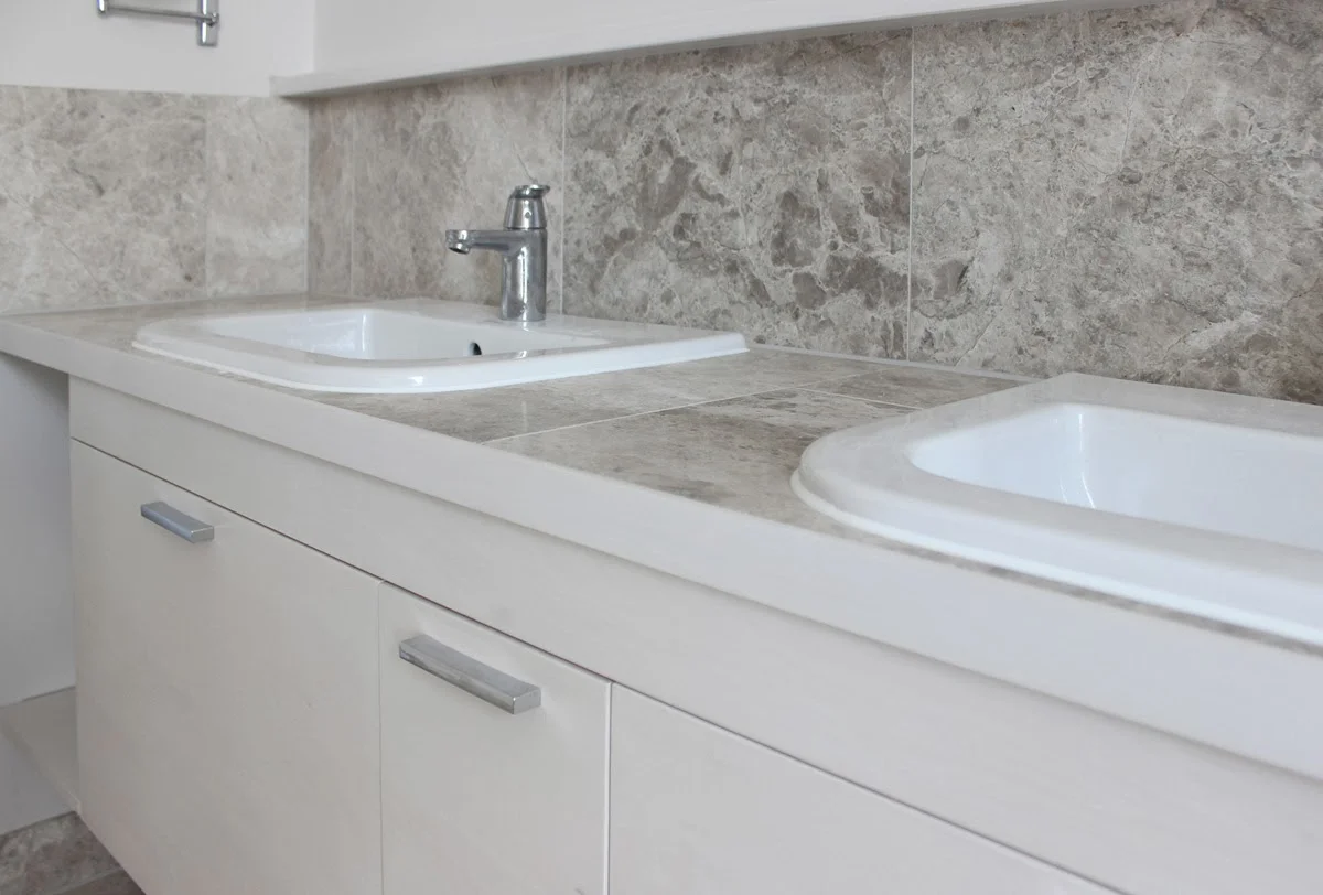
A good deal of time was spent sourcing the most appropriate items to work in this space. The washbasin is by Scarabeo Ceramiche from Italy. It's slightly dished and positioned on a slight angle to lead the eye into the room. In the design it rests delicately on top of the wenge, floating vanity unit.
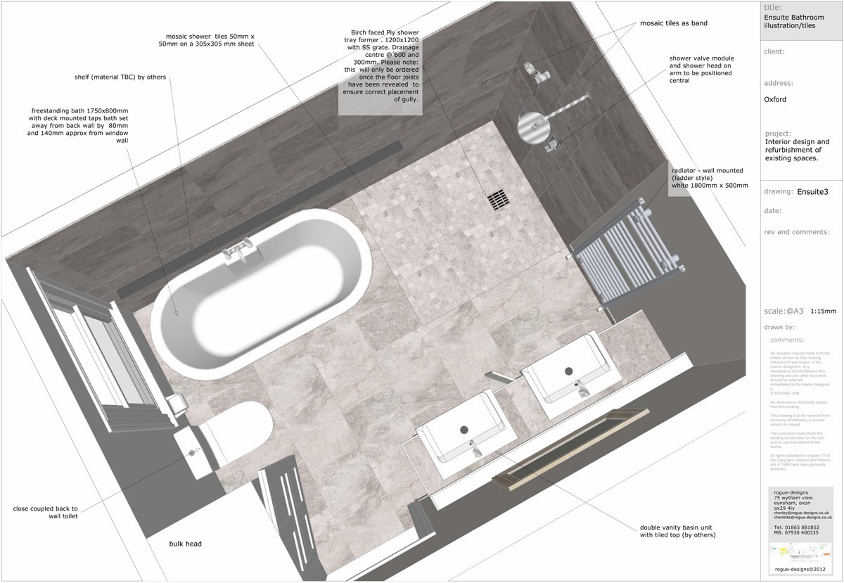
This unit was modified to suit the space, with great care as the internal runners could not have been altered. The toilet by Vitra is concealed behind the dwarf wall that contains the cistern, and is asymmetrical. This means the floor is un-interupted and can be cleaned very easily. In order to do this we created a dummy wall, that was incredibly well anchored to the wall and floor. In fact the steel frame (gerberit) that was used had to be set into the wall in order to not exceed the width restrictions of the room.
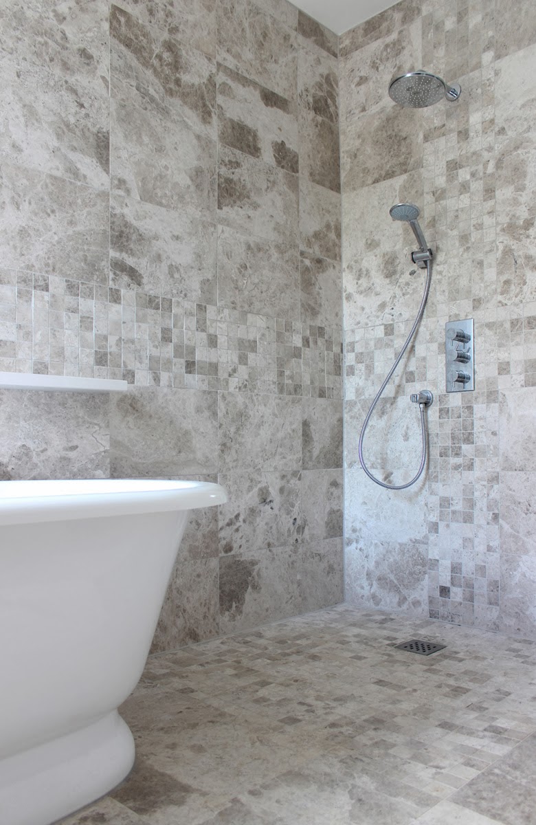
The whole of the floor is a wetroom tray from our friends at On the Level, which has been tiled and has underfloor heating for maximum comfort. Underfloor heating also helps a wetroom to dry out quickly. The tiles are Italian porcelain in grey and matt black, in varying sizes. We created a pattern to provide architectural interest and texture.


