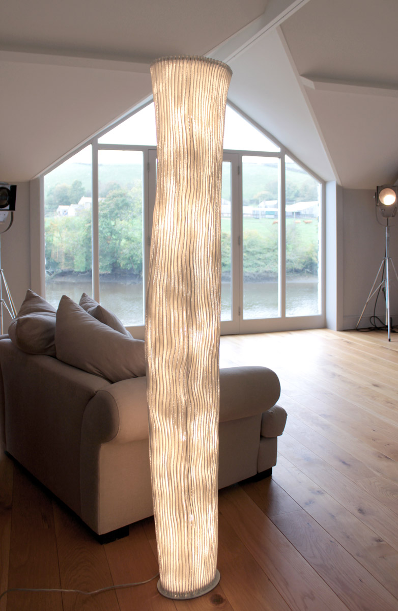
North Oxford Villa

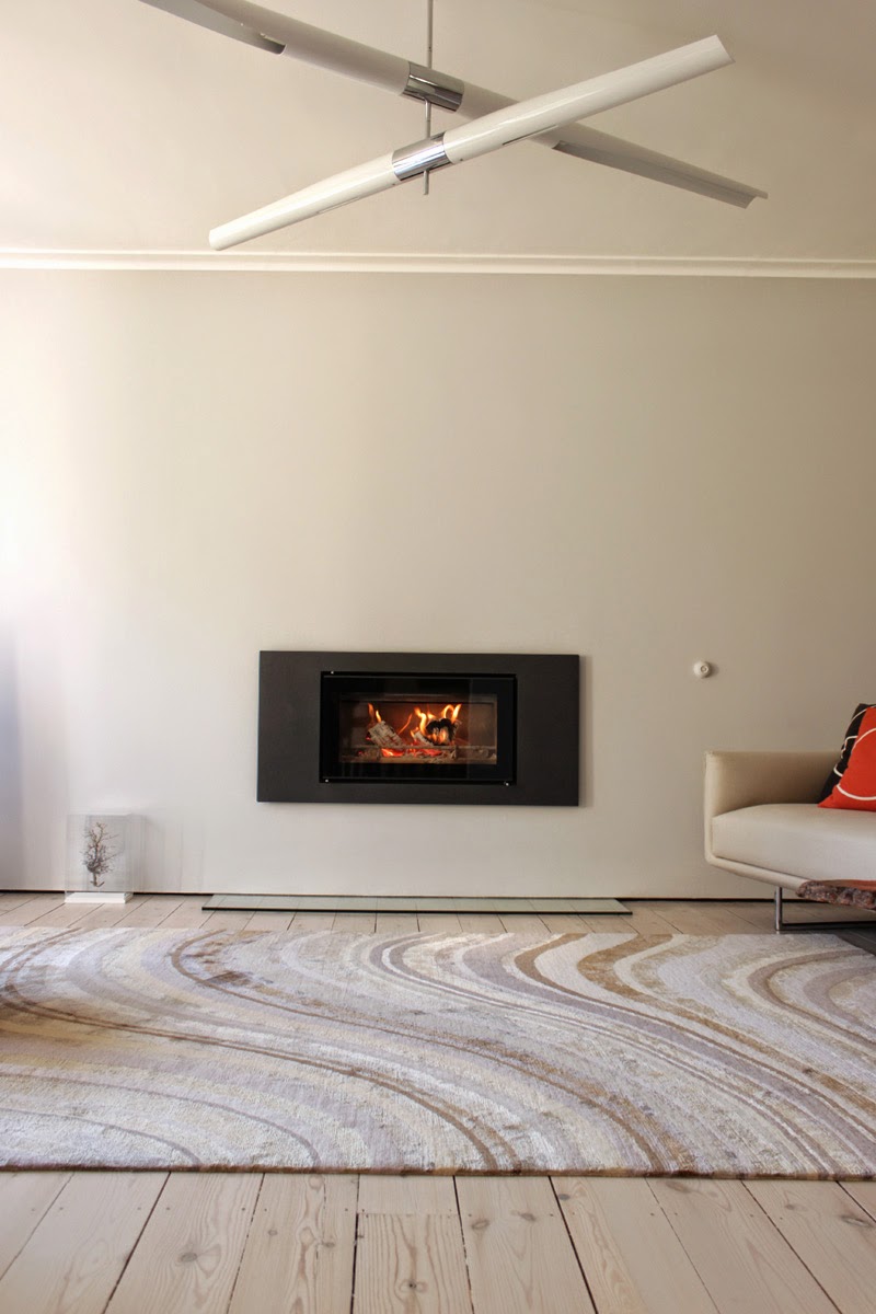
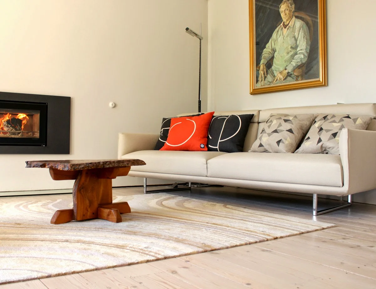
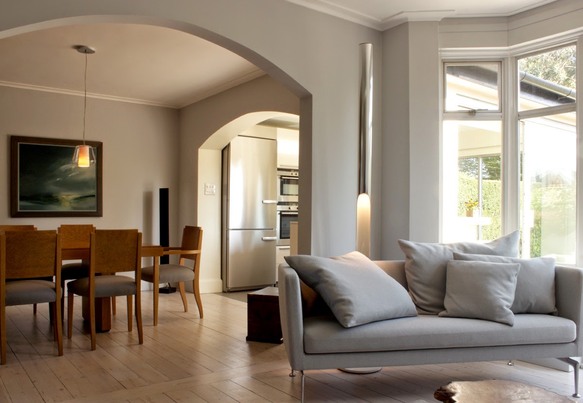
This is a very elegant lounge and dining space with some fantastic features. The whole space is bright, crisp, chic and ethereal.

The lighting: 

Ceiling: a spectacular sculptural piece by David Weeks Studio.  Complimenting this; Toboo by Fontana Arte - a floor standing light that has a ceiling uplighter coupled with the potential for a reading spot and finally 'Etica' by ilide which are hanging pendents that sit above the dining table. These have a ceramic inner core surrounded by a beautifully clear glass. Glow red and orange in the evening and create a soft warm relationship with the surroundings.  Above the bookshelves we placed 3 LED thin strip book shelf lighting units by Catellani & Smith.

Sofas are by MDF Italia and Vitra 

The flooring was given special attention with a full restoration or replacement and finished with a layers of whitened tones that are pulled from the wall colour to add unity throughout.

Custhom designs add a touch of punchy graphic clarity, especially in the striking burnt orange colour.

The bookshelves were made bespoke by rogue-designs and feature inset audio visuals. They are constructed in Ash with a grey hardwood edging to compliment the other softer tones of the rooms.

 Click through to see this project on our website:

rogue-designs

Extension with wrap around glazing and feature stove

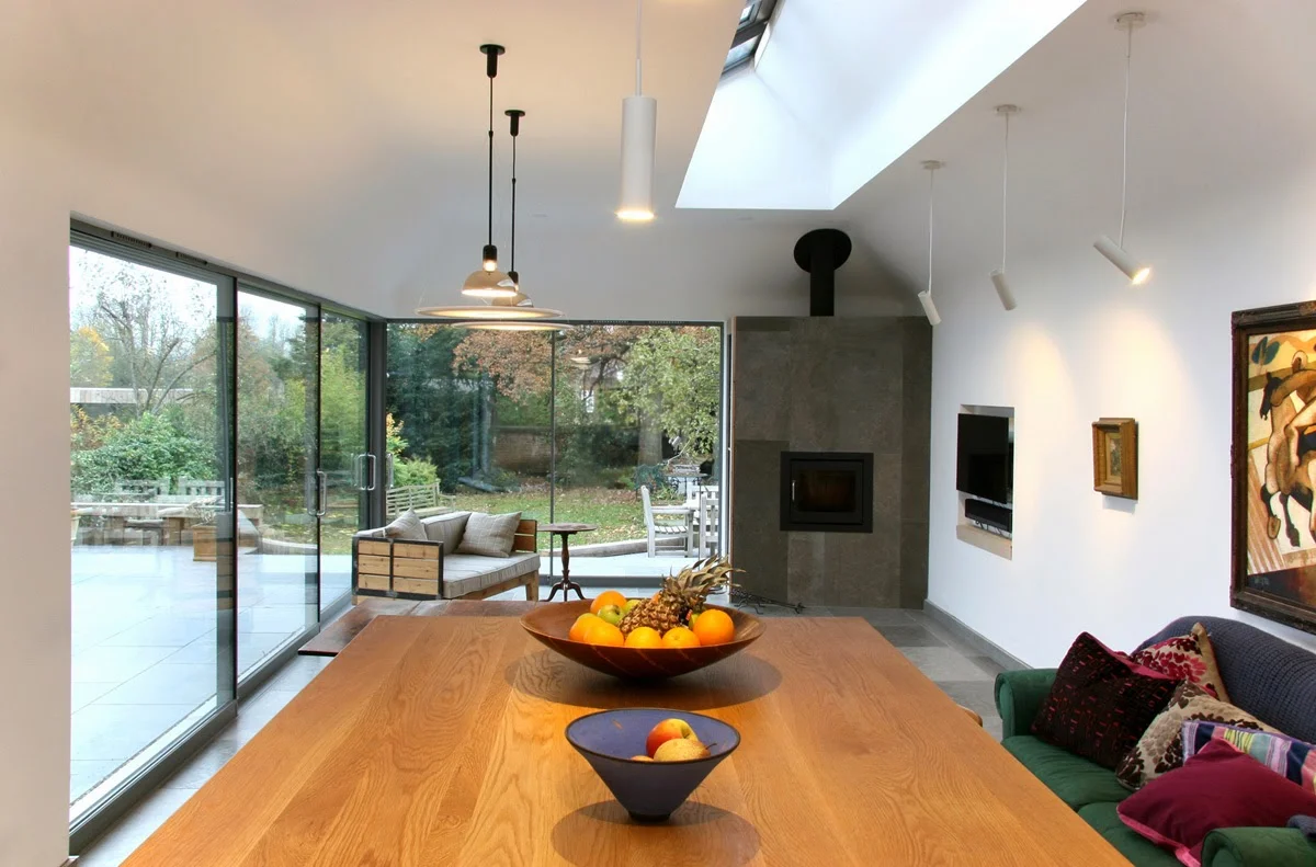
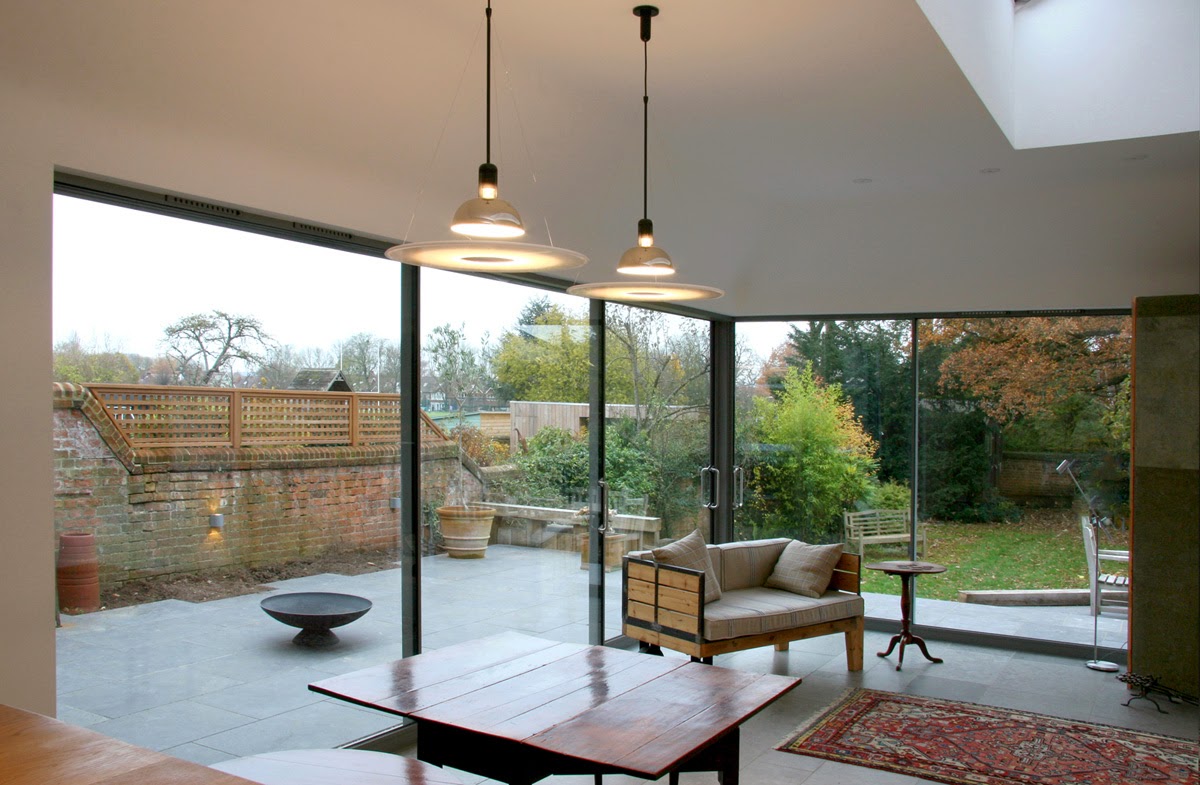
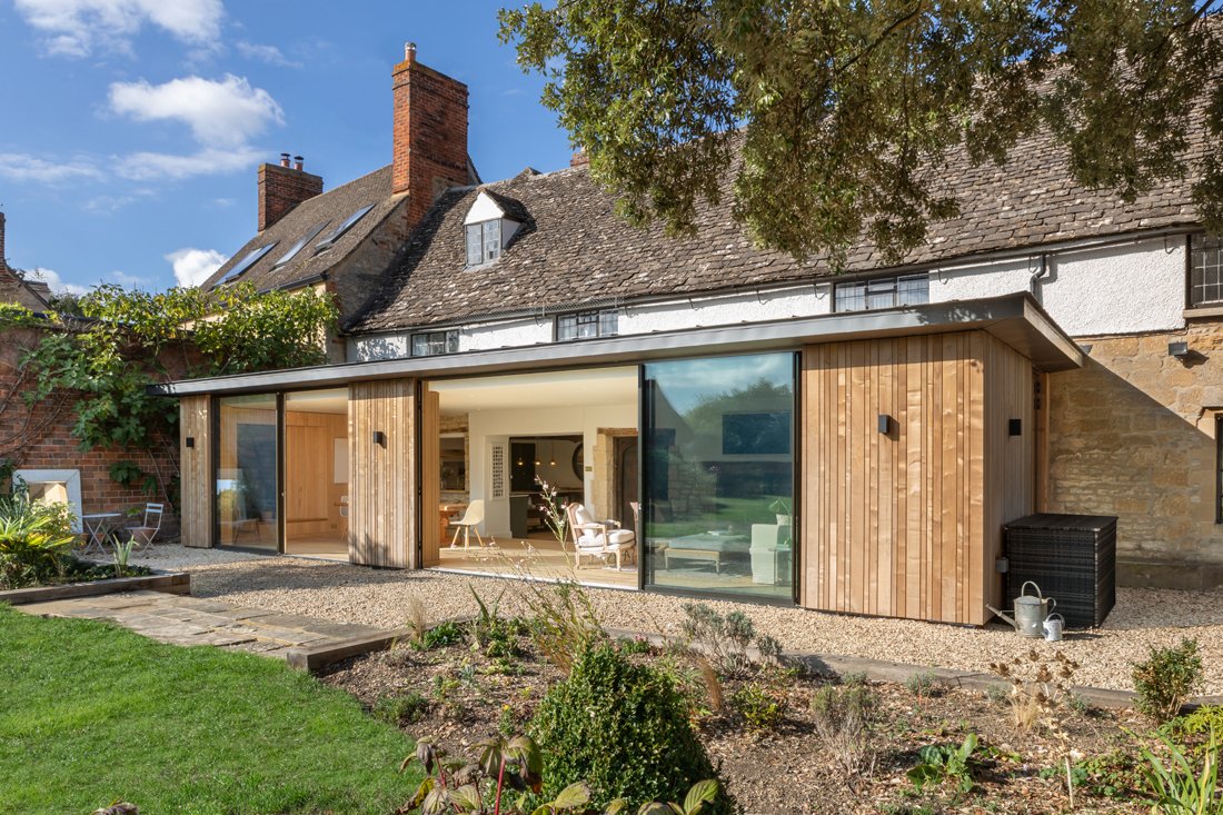
This is a project that fully embraces the beauty of open spaces with warm tones and a gentle touch. Allowing a great deal of light in and giving a quality of scandinavian cool. The brief was to design a substantial ground floor extension that would work in both contrast and harmony with a traditional North Oxford house.

The development of this design was carried out over a long period of consultation with the clients, to get the maximum quality to the space whilst working within a specific budget. Architecture was devised working with Ifor Rhys, and the contract completed to a great standard by Stuart Barr Ltd.

Its a picture of restraint, and with the settling of this project late in the year it will be very exciting to see the garden and extension in full bloom giving the full picture to the original concept of outdoor / indoor extension.

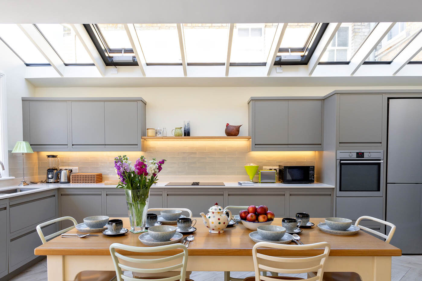
The kitchen, hand made by Barr Kitchens links the Victorian house and its contemporary extension, view more kitchen details here

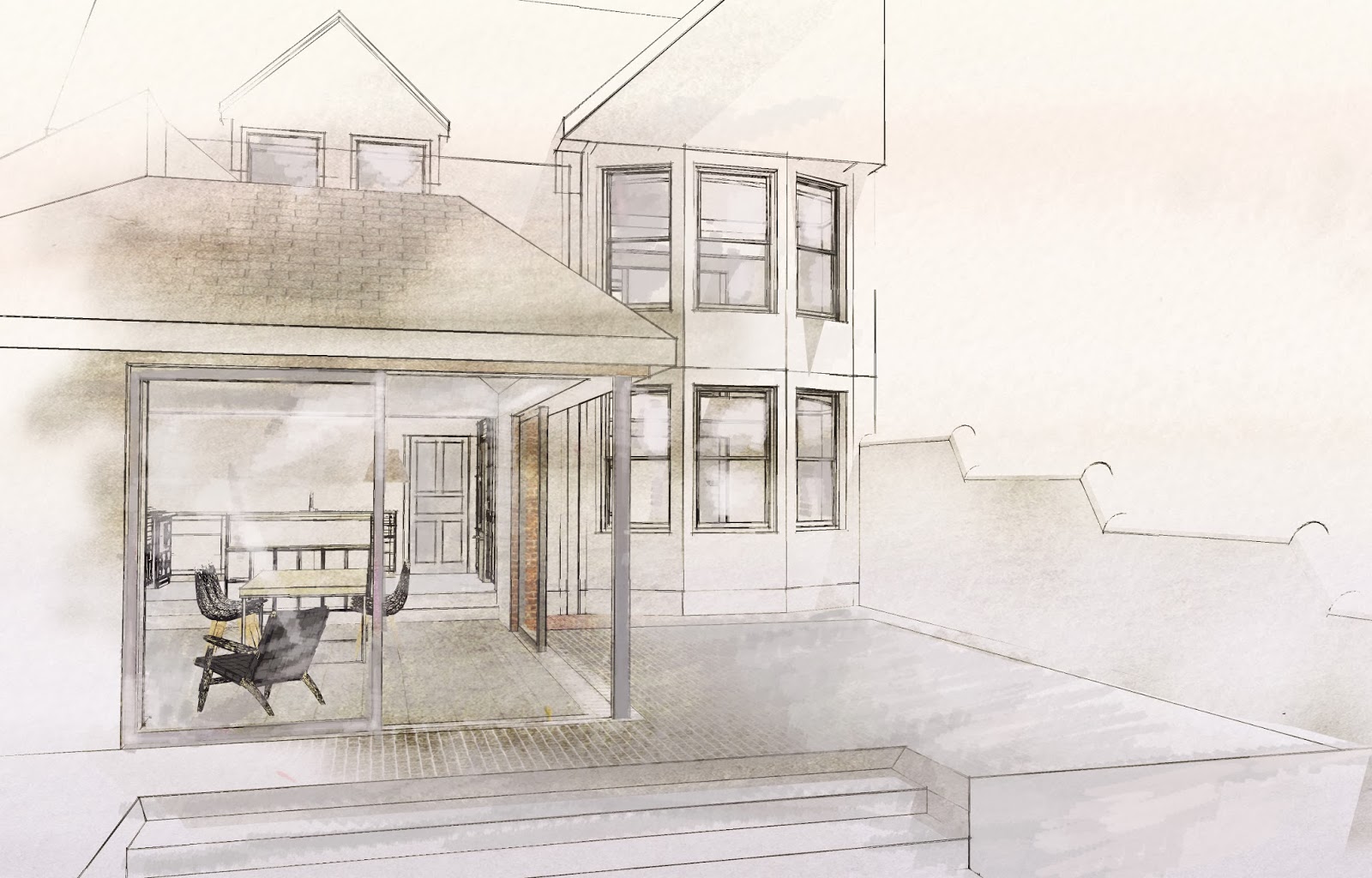
The illustration below shows our early vision for the project. We will be posting a vimeo video of the sketch up model shortly. In brief, a small existing extension was removed, and the back of the house opened up to create a through kitchen an huge space for indoor/ outdoor dining and entertaining, linked externally by level threshold paving externally.

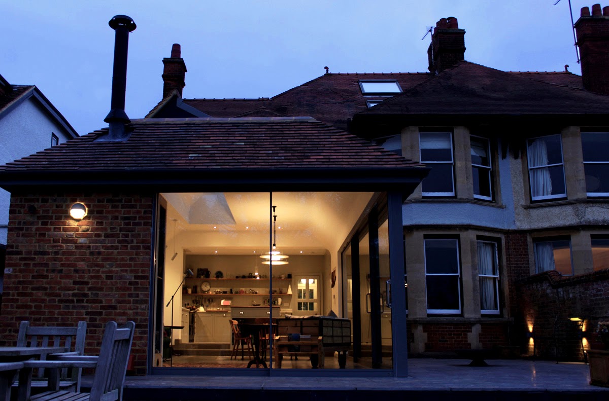
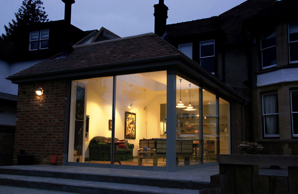
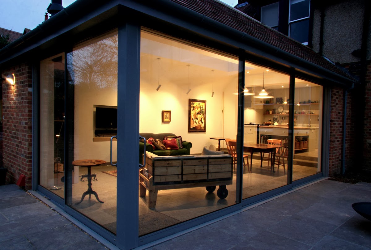
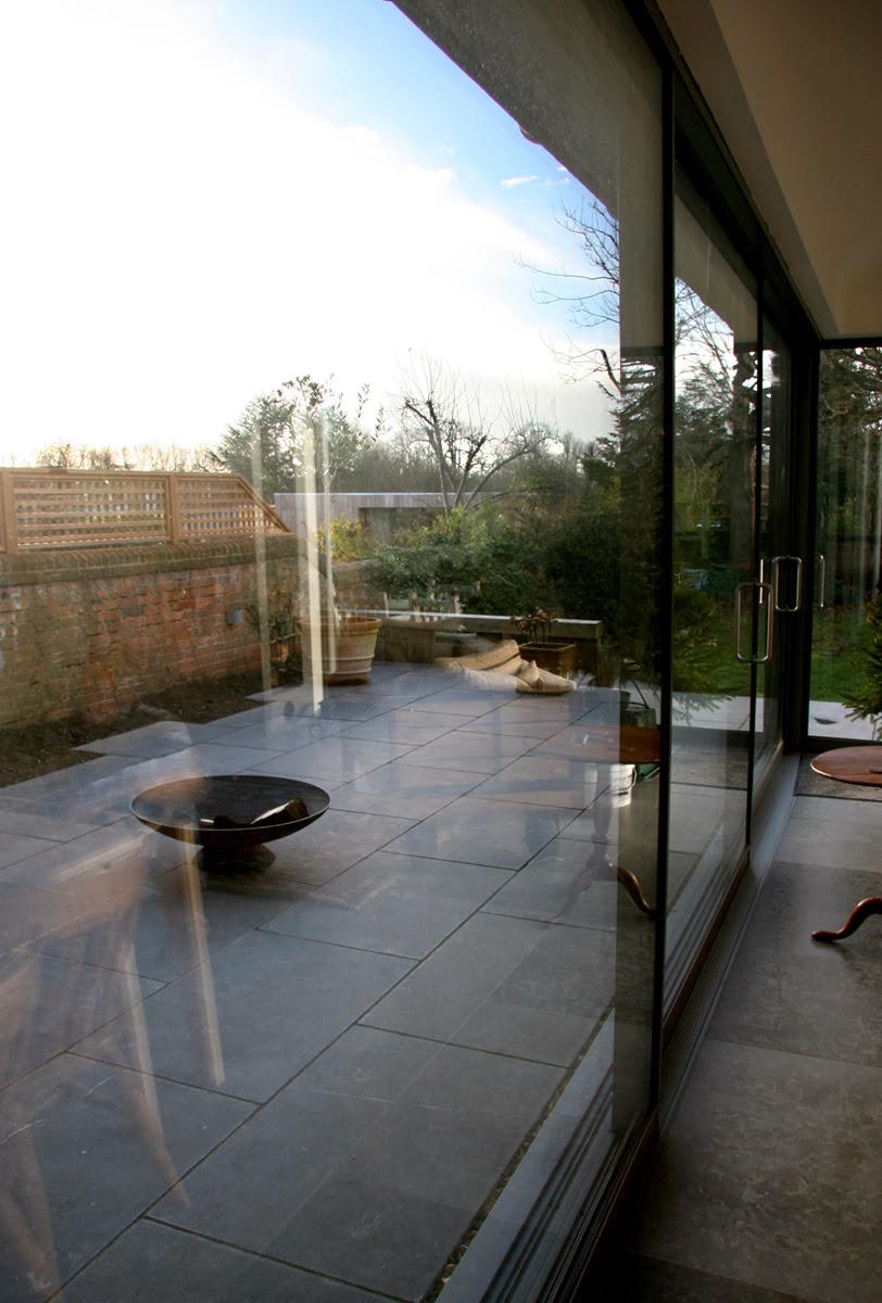
Wrap around sliding doors on the corner take in even the winter sun, and create a real sense of openness. These were commissioned and installed by fineline aluminium architectural glazing who's slimline profiles particularly suited the projects requirements. Detailing the exterior includes

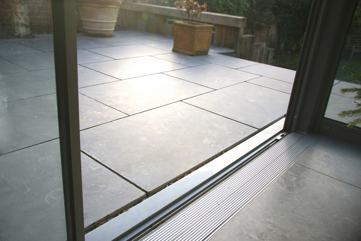
level thresholds seamlessly linking the natural stone inside and out, colour matched guttering and rainwater pipes, and reclaimed bricks and tiles so that the not inconsiderable extension blends with the original house and neighbouring rooflines. 

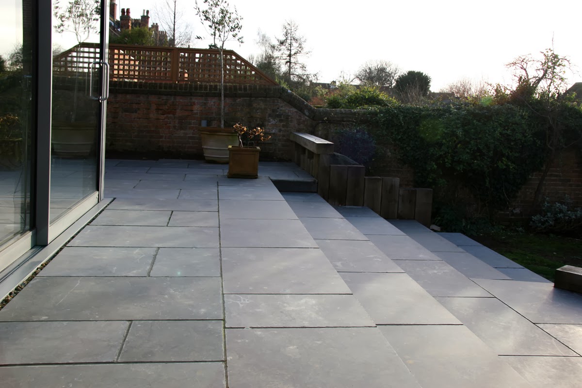
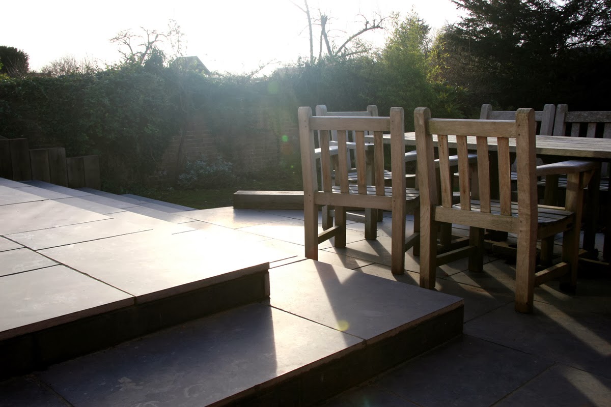
The external works were designed to take advantage of the scenery. The paved areas at the rear fall to lawn level in large patio steps for outdoor seating. The flooring on the main patio follows through on the same level as the extension with a large format non slip slate. Cut outs in the paving against the garden wall create pockets for planting, mainly herbs but with some herbaceous planting for volume. 

This impressive extension was designed in collaboration with  

Ifor Rhys architect

 which with his clever roofline detail adds vertical church like architecture to the whole shape of the project space. From the kitchen through the top of the window there is also a small view of the canopy of the large Oak at the rear of the garden through the standard patent glazing roof lights. Curved plaster rolls internally soften the whole space, and the light floats rather than creating shadows. 

The roof is very neat and incorporates riverbed shingle with the necessary falls to drainage.

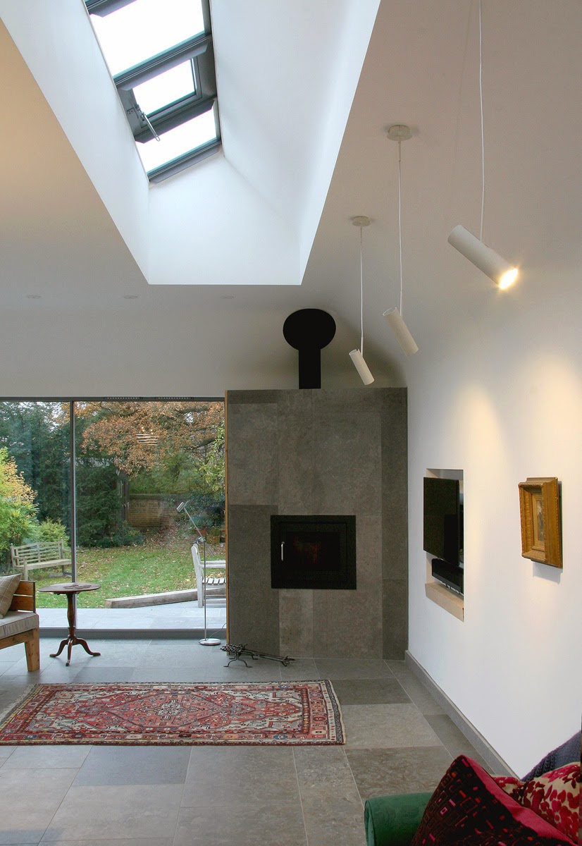
This elegant stove feature was designed with scandinavian ceramic fireplaces in mind. It was put on the angle to allow a view of the fireplace from all over the room and to make it more inclusive and social. The running pattern design of the flooring follows up the chimney breast. The side of the fireplace allowed for a slightly concealed open storage section for wood and stove ephemera, but this is not so evident from the main part of the room.

The architecture works to capture the suns position in that it would throw light around the whole of the space. A long large gallery wall also creates a space for display bringing a museum like quality to the room and lit by Nordlux lighting spots. The TV and sound bar get incorporated into the skin of the building so as not to become too prominent. 

later on we added a rogue-designs extending table made from Ash which you can see detailed

here

.

It sits alongside the industrial vintage 

daybed commission

Solid ash extending table

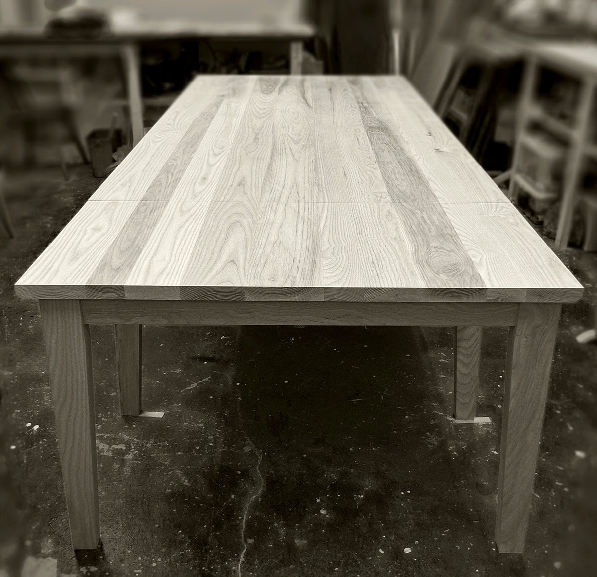
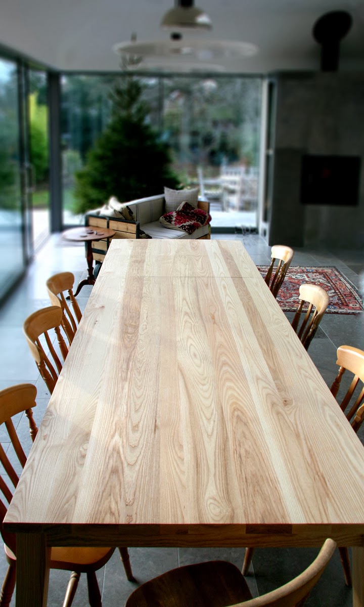
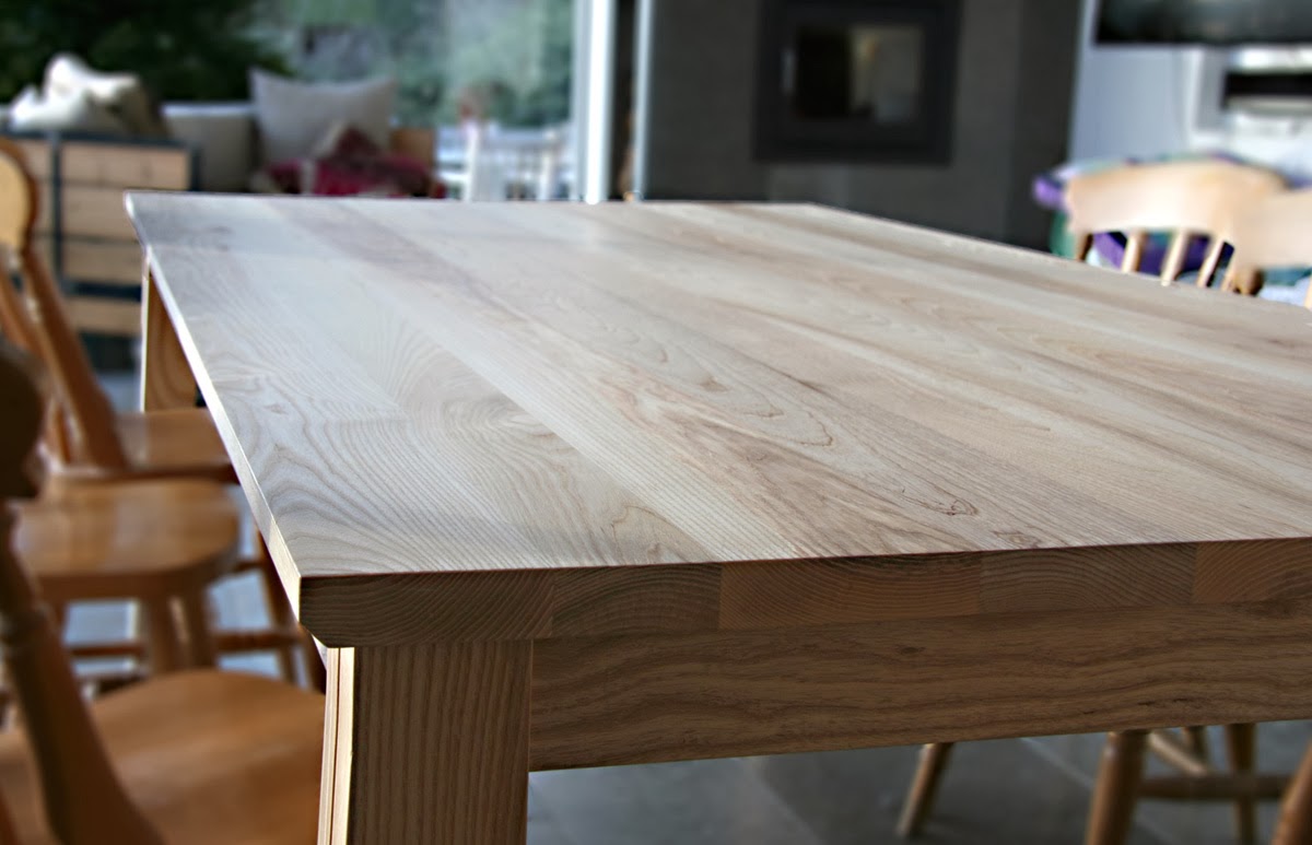
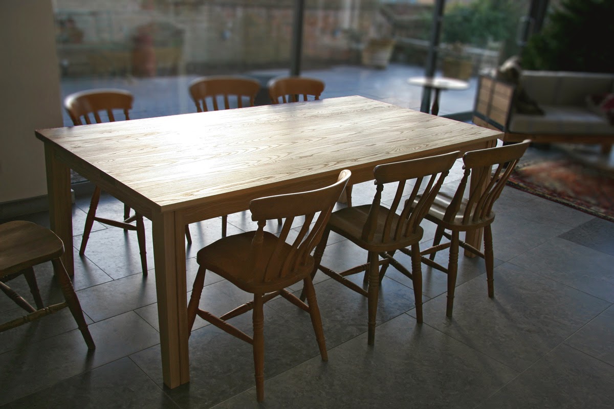
A 10-12 seat extending table in solid ash some 3.1metres long in full extension. In normal station it is an 8 seater with a width of 1metre 10cm. The light ash wood with striking long grain creates a real drama and presence in the room. This was made by rogue-designs in November and was installed just prior to the festive period.

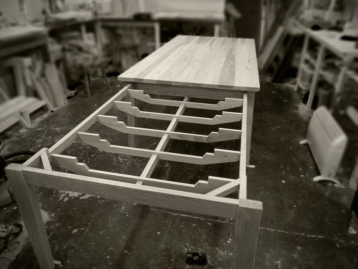
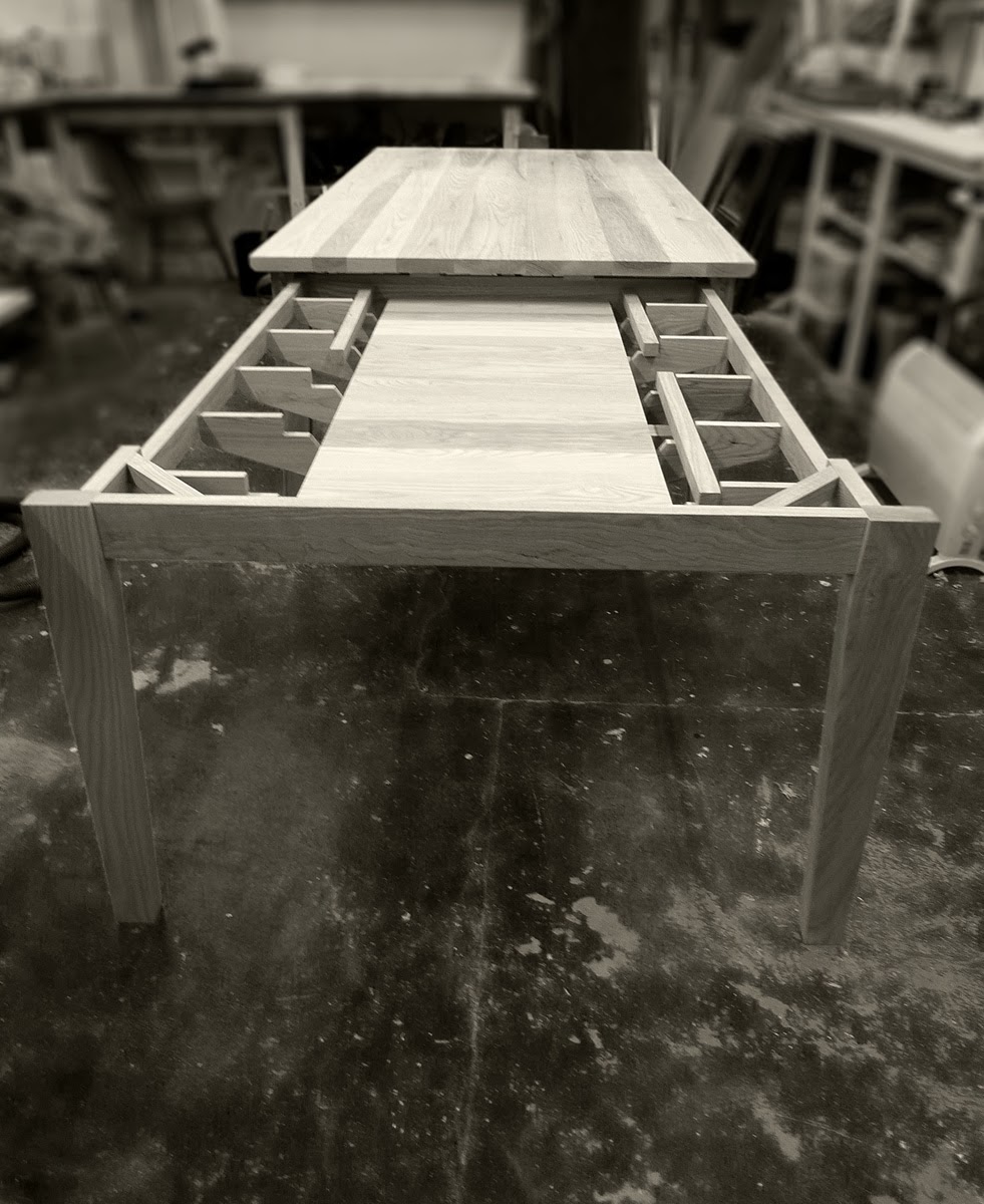
These are some of the shots from the workshop during the making process followed by some in situ shots. The idea was to retain the top patterns of the ash through to the extensions. The design process given the limitations in size and mechanics lead us to explore the separating of one of the legs into two, with two extensions at one end. We created a carriage that slid from inside to reveal ribs that held the two leaves of the top.

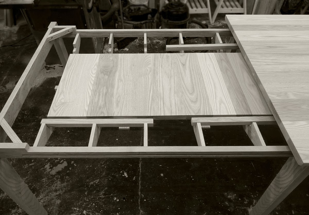
Here you can see the extension at its fullest. The ribs that allow air to flow, and keep the leafs flat. The leg side stretchers were given a shoulder support in the main stable leg in order to taxi along allowing it to be a guide for re-completing the closure. See below. 

The small bars sit on top of the side rails to bring the leaf upto the same height.

Done and in situ alongside the daybed.  The finish applied was an Osmo oil that helps to retain and maintain a natural look.

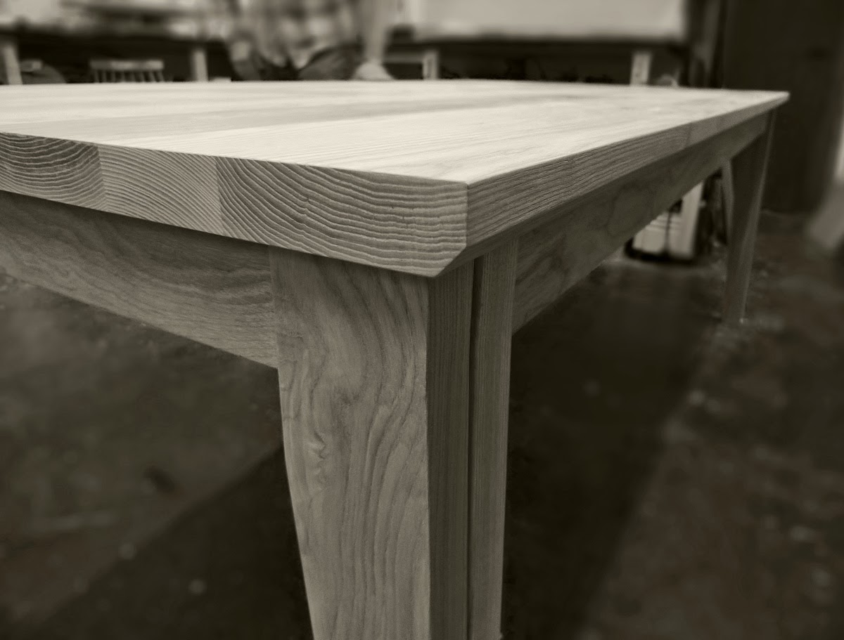
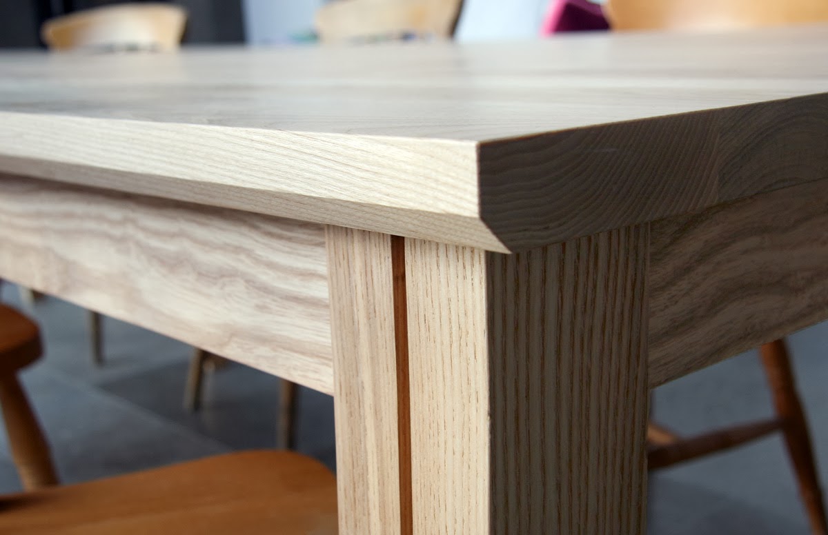
The corner detail showing how beautiful Ash is with its light golden hues and swirling grain. Most of the proportions throughout were controlled by way of the mean division of beauty and proportion.

The 6mm shadowed detail breaks up the large section of the legs making them appear more delicate and refined as well as concealing the point where the 2 end legs separate to extend.